Step-by-Step Watercolor Painting Demonstration - Poppy Fields near Ventabren by John HulseyPoppy Fields Near Ventabren
A Step by Step Watercolor Painting Demonstration
One Spring morning, while driving through the countryside in the south of France near Aix-en-Provence, we stumbled upon a beautiful patch of poppies growing amongst a field of bright yellow Colza plants, which are grown for their valuable oil. The Colza was clearly a cultivated crop, but the poppies appeared to have planted themselves in a beautiful design which led the eye toward the hills on the horizon. The effect was so compelling that we temporarily abandoned our plans to reach the quaint village of Ventabren and set to painting the scene, "tout-de-suite". This demonstration is a studio enlargement of the study John painted on that beautiful morning. 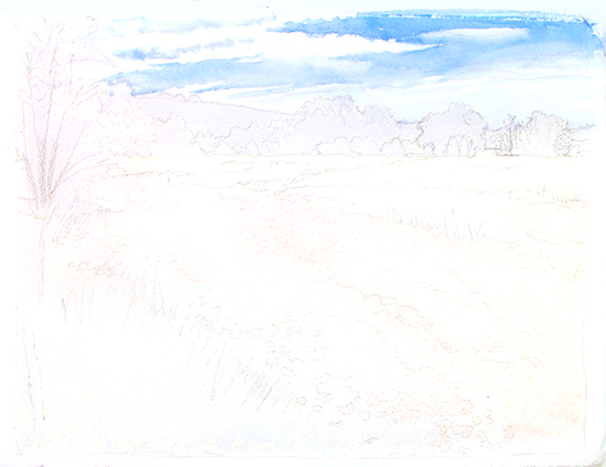 Step One. For this painting demonstration I have selected a half sheet (15.5 x 20.5) of Arches 300 lb. Cold Press paper onto which I have drawn my composition lightly in pencil (HB). I also went the extra step of very faintly adding some watercolor tone to indicate the large masses so that these areas would show up better in these photographs. In watercolor it is often best to work the lightest values and colors first, successively moving towards the darkest tones as the painting progresses. In this way, we are always able to establish or fix edges with each darker layer of wash. I pre-painted the sky with clear water first, leaving dry paper gaps where I wanted pure white clouds to remain. Then using the mix shown below, I defined the shapes of the clouds in the "negative" space surrounding them. Step One. For this painting demonstration I have selected a half sheet (15.5 x 20.5) of Arches 300 lb. Cold Press paper onto which I have drawn my composition lightly in pencil (HB). I also went the extra step of very faintly adding some watercolor tone to indicate the large masses so that these areas would show up better in these photographs. In watercolor it is often best to work the lightest values and colors first, successively moving towards the darkest tones as the painting progresses. In this way, we are always able to establish or fix edges with each darker layer of wash. I pre-painted the sky with clear water first, leaving dry paper gaps where I wanted pure white clouds to remain. Then using the mix shown below, I defined the shapes of the clouds in the "negative" space surrounding them.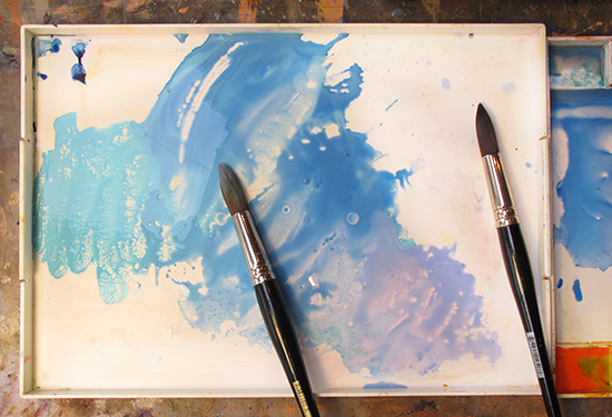 My John Pike studio palette showing my initial color string mix for the sky tones. As you can see, I have a nice range of tones from pale blue to lavender from which to select. This string was made from Horizon Blue (Holbein), Cerulean Blue, and Lavender (Holbein). I painted the sky with a pair of size 20 Richeson synthetic rounds. My John Pike studio palette showing my initial color string mix for the sky tones. As you can see, I have a nice range of tones from pale blue to lavender from which to select. This string was made from Horizon Blue (Holbein), Cerulean Blue, and Lavender (Holbein). I painted the sky with a pair of size 20 Richeson synthetic rounds. 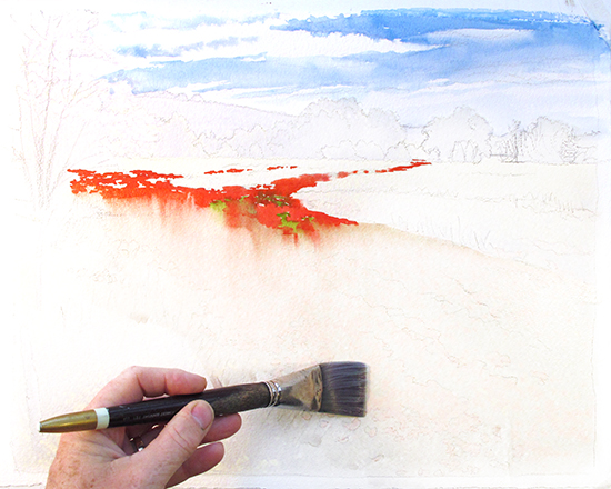 Step Two. Using a mix of Cadmium Red Light, Cadmium Orange and Alizarine Crimson, I began establishing the shape of the red poppies by working wet color on dry paper. It was important to get the shape of the poppies trailing off into the distance just right, so I did not use a negative painting approach here, which can sometimes result in less specific shapes. Note how I left some islands of white paper within the red wash. Once I brought the red wash down into the larger shape of the poppies, I switched brushes to a 1-inch flat and began painting clear water over the entire poppy shape, also leaving some dry holes here and there. I was unconcerned at this point about the red color running down into my wet wash. Instead, I began to apply some yellow greens (Sap Green, Cadmium Yellow Pale) into the holes with my pointed round brush, letting them bleed a bit. To work a wet color next to and touching a wet wash, the ratio of water to paint in the color must match the water already on the sheet, or one will flood out the other. What is wanted is that both colors live in the same spaces but with a bit of softening on the edges. Step Two. Using a mix of Cadmium Red Light, Cadmium Orange and Alizarine Crimson, I began establishing the shape of the red poppies by working wet color on dry paper. It was important to get the shape of the poppies trailing off into the distance just right, so I did not use a negative painting approach here, which can sometimes result in less specific shapes. Note how I left some islands of white paper within the red wash. Once I brought the red wash down into the larger shape of the poppies, I switched brushes to a 1-inch flat and began painting clear water over the entire poppy shape, also leaving some dry holes here and there. I was unconcerned at this point about the red color running down into my wet wash. Instead, I began to apply some yellow greens (Sap Green, Cadmium Yellow Pale) into the holes with my pointed round brush, letting them bleed a bit. To work a wet color next to and touching a wet wash, the ratio of water to paint in the color must match the water already on the sheet, or one will flood out the other. What is wanted is that both colors live in the same spaces but with a bit of softening on the edges.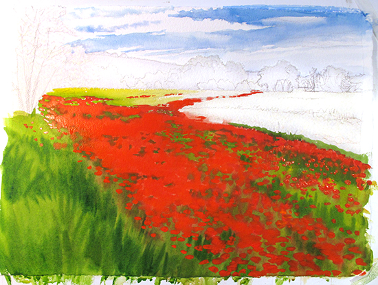 Step Three. Working two colors next to and within each other takes planning, technique and speed, and often there is no stopping until the process is done. It is especially tricky when the two colors are complements, as in red and green—any unintentional mixing of those two creates a useless and ugly muddy brown color. To accomplish this wash, I pre-mixed all my greens and reds in my palette in sufficient quantity to supply the whole wash first. Then using two or three brushes, I worked into the wet wash I had created shown above with both colors at the same time, paying special attention to the water/paint ratios. Because I had already added a lot of water to the sheet first, I was mindful that the mixes in my palette actually needed less water in them to remain strongly saturated. Step Three. Working two colors next to and within each other takes planning, technique and speed, and often there is no stopping until the process is done. It is especially tricky when the two colors are complements, as in red and green—any unintentional mixing of those two creates a useless and ugly muddy brown color. To accomplish this wash, I pre-mixed all my greens and reds in my palette in sufficient quantity to supply the whole wash first. Then using two or three brushes, I worked into the wet wash I had created shown above with both colors at the same time, paying special attention to the water/paint ratios. Because I had already added a lot of water to the sheet first, I was mindful that the mixes in my palette actually needed less water in them to remain strongly saturated.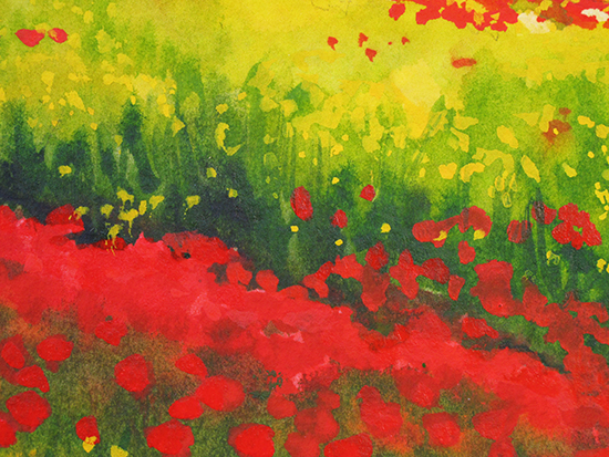 Step Four. This detail shows how I work the positive and negative shapes back and forth, and use the varying transparency of the sedimentary reds to create a layered three-dimensional effect. The large diagonal red shape was painted first, followed by the greens within it. When that was dry, I painted the large light yellow shape above it. While that was still damp, I created the illusion of a dark vertical edge of grasses with varying values of Sap Green and Sap Green with Prussian Blue mixed together. This edge was painted as a positive dagger-like shape in places and a soft negative shape creating the illusion of individual yellow flowers and leaves. Once that was nearly dry, I used very thick Cadmium Red as well as Cadmium Yellow Pale strokes and dabs to overlay addition poppies and flowers on top of the whole works. Step Four. This detail shows how I work the positive and negative shapes back and forth, and use the varying transparency of the sedimentary reds to create a layered three-dimensional effect. The large diagonal red shape was painted first, followed by the greens within it. When that was dry, I painted the large light yellow shape above it. While that was still damp, I created the illusion of a dark vertical edge of grasses with varying values of Sap Green and Sap Green with Prussian Blue mixed together. This edge was painted as a positive dagger-like shape in places and a soft negative shape creating the illusion of individual yellow flowers and leaves. Once that was nearly dry, I used very thick Cadmium Red as well as Cadmium Yellow Pale strokes and dabs to overlay addition poppies and flowers on top of the whole works.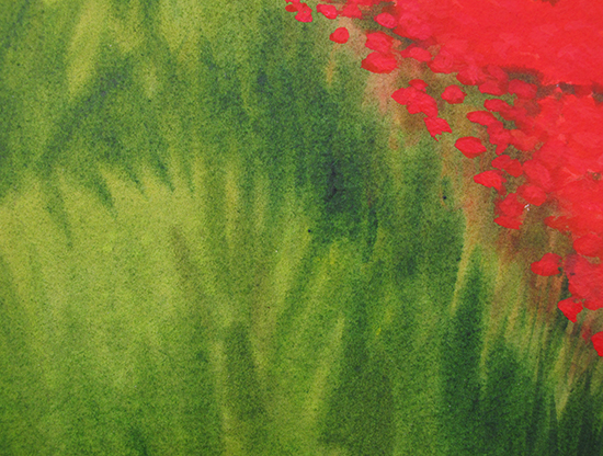 Detail of the intersection of the poppies and the tall grasses. This shows how I kept the grasses edging the field very soft and suggestive so that those shapes would not compete for attention with the poppies. Remember: the eye is attracted to detail—wherever you put it is where it will go. In planning any painting, we must decide where we want our audience to look, and then structure the painting to achieve that goal. This example also shows how I used thick, rather opaque Cadmium Red marks to overlay the initial washes and create a specific hard edge for the poppies against the grass. Some of the red bled into the greens of the grasses here, an effect which, if kept subtle, actually harmonizes the colors to each other better. Detail of the intersection of the poppies and the tall grasses. This shows how I kept the grasses edging the field very soft and suggestive so that those shapes would not compete for attention with the poppies. Remember: the eye is attracted to detail—wherever you put it is where it will go. In planning any painting, we must decide where we want our audience to look, and then structure the painting to achieve that goal. This example also shows how I used thick, rather opaque Cadmium Red marks to overlay the initial washes and create a specific hard edge for the poppies against the grass. Some of the red bled into the greens of the grasses here, an effect which, if kept subtle, actually harmonizes the colors to each other better.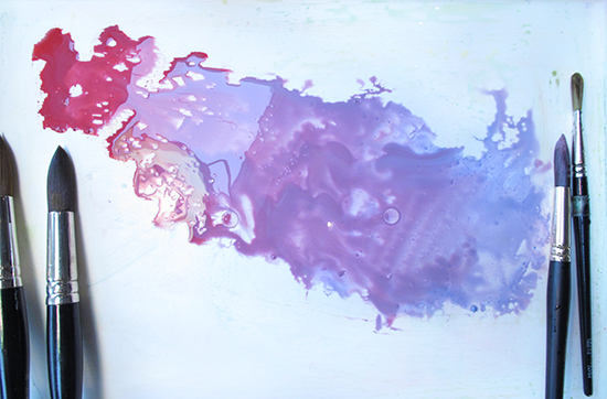 Step Five. Before I paint, I always mix up enough color in the correct consistency to do the job. This image shows the color string I used to paint the Redbud tree on the left of the composition. I realized that it was very important to get the unusual colors of the Redbud exactly right, keeping them clean and saturated. Also, I was unsure how those colors would work with the Cadmium Red and orange that are in the Poppies. By testing those colors together on a piece of scrap first, I could safely make adjustments and get them to work without ruining my progress on the actual painting. Step Five. Before I paint, I always mix up enough color in the correct consistency to do the job. This image shows the color string I used to paint the Redbud tree on the left of the composition. I realized that it was very important to get the unusual colors of the Redbud exactly right, keeping them clean and saturated. Also, I was unsure how those colors would work with the Cadmium Red and orange that are in the Poppies. By testing those colors together on a piece of scrap first, I could safely make adjustments and get them to work without ruining my progress on the actual painting.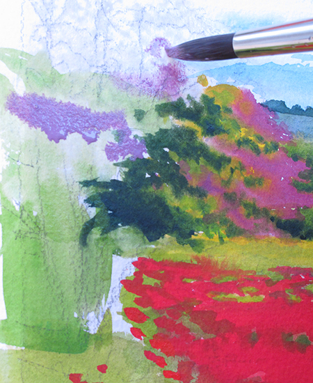 Step Six. I knew that I wanted the colors and shapes of the Redbud to be distinct, but a bit soft. The problem was that the Redbud in my study and my reference had both flowers and leaves on it - an unusual Spring display. I could have dispensed with the green of the leaves and just painted the flowers on bare branches—a much easier solution to the problem. However, I wanted to push myself and see if I could not paint the greens of the leaves and the lavender-rose colors of the flowers side by side, and I was willing to risk ruining the painting in order to do it. After all, it is just a piece of paper. If I could paint it once, I could certainly paint it again, and what I learned in the process would be very valuable. The truth about painting with watercolor is simple: paint the picture over as many times as needed to get it right. And by right, I mean so that it looks like it was painted all at once in about 20 minutes.This is one of the lessons I have learned from the masters of the medium. This image shows my progress using a size 12 Richseon round on damp paper. Step Six. I knew that I wanted the colors and shapes of the Redbud to be distinct, but a bit soft. The problem was that the Redbud in my study and my reference had both flowers and leaves on it - an unusual Spring display. I could have dispensed with the green of the leaves and just painted the flowers on bare branches—a much easier solution to the problem. However, I wanted to push myself and see if I could not paint the greens of the leaves and the lavender-rose colors of the flowers side by side, and I was willing to risk ruining the painting in order to do it. After all, it is just a piece of paper. If I could paint it once, I could certainly paint it again, and what I learned in the process would be very valuable. The truth about painting with watercolor is simple: paint the picture over as many times as needed to get it right. And by right, I mean so that it looks like it was painted all at once in about 20 minutes.This is one of the lessons I have learned from the masters of the medium. This image shows my progress using a size 12 Richseon round on damp paper.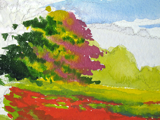 Here is another detail which shows my multi-color Redbud tree wash in progress. Careful water management is needed to get these colors to sit side by side without flooding into each other. The green wash of the background trees was laid in first, leaving negative edges of dry paper for the Redbud to nestle into, and allowed to dry. Here is another detail which shows my multi-color Redbud tree wash in progress. Careful water management is needed to get these colors to sit side by side without flooding into each other. The green wash of the background trees was laid in first, leaving negative edges of dry paper for the Redbud to nestle into, and allowed to dry.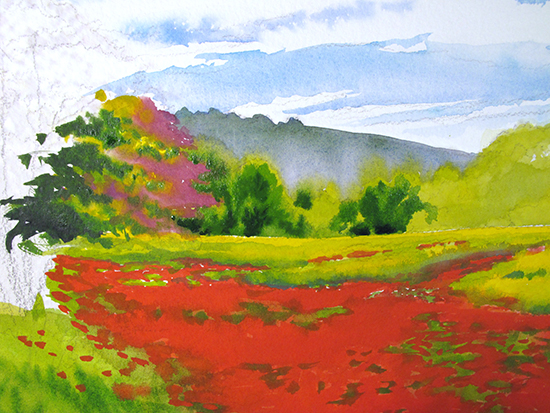 Step Seven. Satisfied that my Redbud experiment would work, I stopped there and concentrated on the background. I painted the distant hill in with rather neutral grayish tone made from a lavender-blue mix with a touch of green, being careful to stop short of the ground plane. I did this so that my next wash of light yellow-green trees could be painted on top of the previous one, strengthening it and feathering the tops of the trees into the still-damp hill wash. Before that was dry, I immediately began building darker green shapes into the trees which would be suggestive of tree architecture and smaller trees and shrubs growing within and in front of them. The background is all about suggestion, not specifics! Step Seven. Satisfied that my Redbud experiment would work, I stopped there and concentrated on the background. I painted the distant hill in with rather neutral grayish tone made from a lavender-blue mix with a touch of green, being careful to stop short of the ground plane. I did this so that my next wash of light yellow-green trees could be painted on top of the previous one, strengthening it and feathering the tops of the trees into the still-damp hill wash. Before that was dry, I immediately began building darker green shapes into the trees which would be suggestive of tree architecture and smaller trees and shrubs growing within and in front of them. The background is all about suggestion, not specifics! 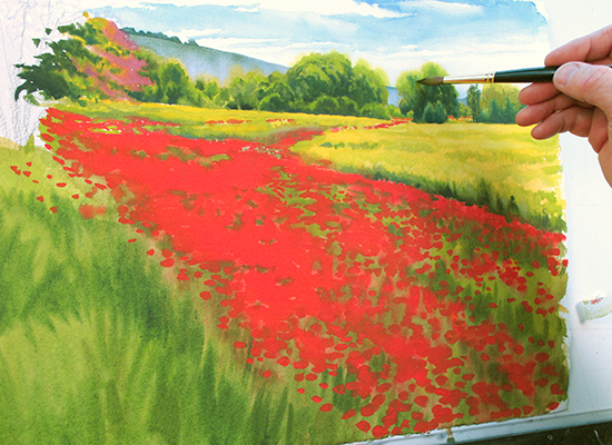 Step Eight. Working light to dark, making progress on the background trees. See how convincing all those washes and tone changes can be when a consistent, mindful technique is applied. I paint both positive and negative shapes to suggest all manner of foliage, but my goal is always the same: express the light, not the details. Distant background objects should always be slightly out of focus, the way our eyes see, not the way a camera does. Step Eight. Working light to dark, making progress on the background trees. See how convincing all those washes and tone changes can be when a consistent, mindful technique is applied. I paint both positive and negative shapes to suggest all manner of foliage, but my goal is always the same: express the light, not the details. Distant background objects should always be slightly out of focus, the way our eyes see, not the way a camera does.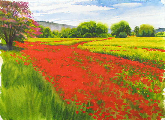 After the background was dry, I concentrated on finishing the Redbud tree on the left and added the shadow beneath it, which served to anchor that shape into the ground. A few quick strokes of a mix of Prussian Blue and Burnt Umber to suggest a fence line and this painting was done. After the background was dry, I concentrated on finishing the Redbud tree on the left and added the shadow beneath it, which served to anchor that shape into the ground. A few quick strokes of a mix of Prussian Blue and Burnt Umber to suggest a fence line and this painting was done.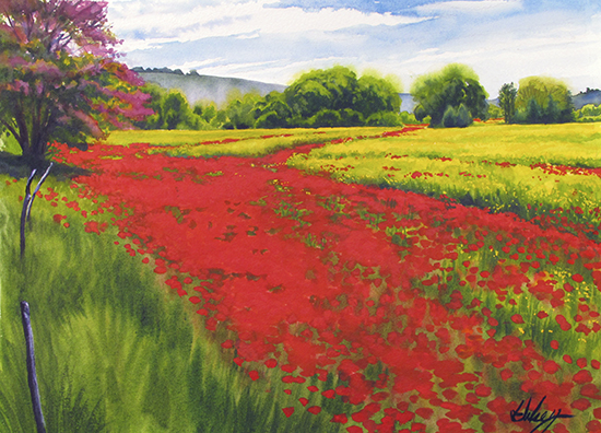 Poppy Fields Near Ventabren Watercolor © John Hulsey
|
Become an Artist's Road Member Today!
Already a Member?Log in here. To renew your membership, log in and follow the links. Search the SitePerspectivesNot ready to become a Member yet? Subscribe to our free email postcards, "Perspectives". Enter your email address here.
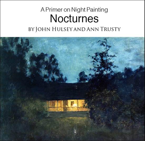
Member ContentFree ContentThe Artist's Road StoreNocturnes - A Primer on Night Painting Filled with inspirational examples by the masters of nightime painting, this little book is sure to fire up your creative energies. Never tried painting at night? We show you how it's done with a step-by-step-oil demo and a tale of night painting in the wilds of Rocky Mountain National Park. The Primer on Night Painting - Nocturnes is a 7 x 7" PDF download with 40 pages of text and images. It includes a gallery of paintings by masters of the nocturne, information to inspire and encourage you in your plein air nocturne painting, an illustrated step-by-step demo and tips for working in pastel and oil. Also available in a softcover edition. Check out the tools and other products that we use in our own art and travels in The Artist's Road Store. We only offer things for sale that we enthusiastically believe in.
About Us
|

 Voices of Experience:Richard K. Blades
 ing Watercolors
 Nocturne Notes
 Inspiration in Monet's Gardens
 The Watercolor Medium
 The Perspectives Archive