It's Not Easy Seeing Green - Twelve Artists Share Their Favorites

| Next
 
It's Not Easy Seeing Green:
Twelve Artists Share Their Favorites

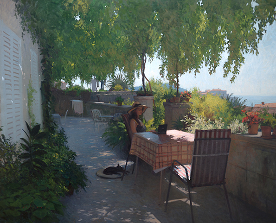
oil paintng of woman on terrace, by Marc Dalessio
The Terrace in Dubrovnik                47 x 59"             Oil               © Marc Dalessio

The Color Green
   Mixing accurate and harmonious greens can be a real challenge for the painter. Trial and error and lots of practice often leads each artist toward developing favorite mixes of greens which they use reliably in their work. To add complexity to the subject, recent scientific research has revealed that men and women perceive greens differently. (See "Tomato Tomahto"). Different seasons and different climate zones can require modulations of the cool/warm relationships of the greens in our palettes, and we must be aware of these changes as we travel or the entire painting will be off. For example, spring greens can be shockingly bright against the muted winter colors often still present. These fading winter tones create a backdrop that allows the sparkle of spring colors to stand out for a few weeks. But it won't be long before what we call "The Wall of Green" descends upon the landscape, and those bright greens gain depth and warmth, changing our palette again. Painting the greens of dry, high mountain forests will be a very different palette mix from painting the palm trees and deciduous forest of the southern seacoast. The color is all around us and it is a good idea to develop expertise in mixing its various guises.

A Bit of History
   In ancient times, artists had very few sources for green pigments. The Egyptians used ground malachite, a naturally-occurring stone, and also developed the first synthetic pigment, Egyptian Blue, which they mixed with Naples Yellow to make greens. Egyptian blue is a synthetic blue pigment made up of a mixture of silica, lime, copper, and alkali. The earliest evidence for the use of Egyptian blue is in the 4th Dynasty (c.2575-2467 BC). Egyptian pharaohs were patrons of the arts and consequently were devoted to the advancement of pigment technology.

   The Romans also used malachite, verdigris and a new color, green earth, which is a type of clay colored by iron oxide, magnesium, aluminum silicate, or potassium. Large deposits of green earth were discovered in the South of France near Nice, and in Italy around Verona, on Cyprus and Bohemia. It was used in wall paintings and murals in Herculaneum, Lyon, Vaison-la-Romaine, and other Roman cities. It was sometimes called Green of Verona.

   Verdigris, or copper carbonate, is made by placing a plate of copper, brass or bronze in fermenting wine (or vinegar) for several weeks and then scraping off and drying the green powder that formed on the metal. The Romans used verdigris in making the murals at Pompeii. However, verdigris is unstable, does not mix well with other colors, is subject to dampness and can turn dark unless carefully stabilized with a varnish. Even so, the need for green pigment in painting was so important that It was widely used in miniature paintings in Europe and Persia in the 16th and 17th centuries. Its use largely ended in the late 19th century, when it was replaced by the safer and more stable chrome green.

   It took a long time before other, more stable synthetic greens were developed, some accidentally, some as part of an intentional process to make new pigments.
The translucent pigment cobalt green, variously known also as Rinman’s or zinc green, was discovered by a Swedish chemist, Sven Rinman in 1780.

Green chrome oxide was created by the chemist Pannetier in Paris in 1835.
In the 19th century, emerald green was created by hydrating chrome oxide. It was also called Guignet Green for a while. Also about that time, English green was made by mixing Prussian blue with chrome yellow.
In 1927, pthalocyanine dye was accidentally created by Swiss chemists.

What Some of Our Friends Are Using Today
   We asked twelve artists to tell us how they tackle the color green - which paint brands and colors they buy, what colors they use to create their mixes. We've put their comments next to examples of their works below. (All artwork copyright the artists.)

Scott Burdick

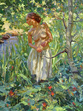
oil painting of woman in forest by Scott Burdick
Forest Beauty            40 x 30"                Oil

   I just use viridian green, as well as mixtures with ultramarine blue, cobalt blue, and ivory black with cadmium yellow and lemon yellow for my greens. I don't have any special mixtures, but just fool around until I get the colors I see. My main tip on painting green is to find the purest green in your subject to start with and then compare everything to that. If you look at each green by itself, you will make them all the same in intensity.

Thomas Paquette

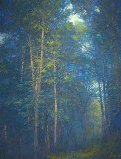
oil painting of woddland by Thomas Paquette
Trail                   54 x 39"                  Oil     

   I have noticed a discrepancy in perception of greens with (my wife) Ellen on some paintings. . . However, I have kind of seen this problem for a long time and have consciously tried to shift the play of my greens to include a wider warmer range, or at least to mix it up a bit between paintings. Beyond this, I should note that in the same way Caravaggio is reputed to have said that blue is the poison of colors, I have an aversion, perhaps strange for an eastern landscape painter, to greens and blues. So it is no wonder why I kick the color around so much in most of my landscapes.
My greens are virtually never from a tube marked "green" (though I do have olive, sap, etc., around here somewhere) except for cadmium green which I use on occasion as a shortcut to mixing a brilliant, light green. I rely on a good hansa yellow light and a cadmium yellow light to start most greens, mixing with every other possible color on my palette, from blues to browns, reds and blacks, to alter. I also like to start contrasting warm greens at the same time from a yellow ochre, just to keep the colors wide. Remember, no color exists so much on its own as it does in relation to adjacent colors, so chiefly for that reason, I have no formula or even pattern for arriving at a green. I mix things around on my palette in piles of color until I see one that, like the missing word in a poem or piece in a puzzle, announces itself as the best shift of color at the moment to work with, whether I am starting a canvas or putting on finishing touches. Remember too, that I am a studio painter for the most part and am not trying to match color to anything outside the canvas's demands. I  can afford to kick the color around for months if I feel it must be done that way. I stock various paints in my studio but my standby brand is Gamblin.

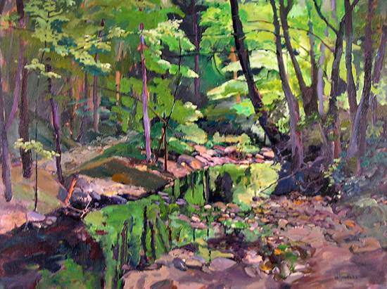
George Van Hook

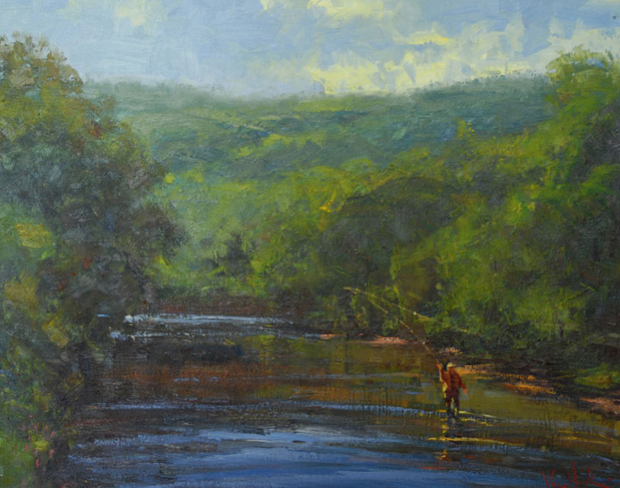
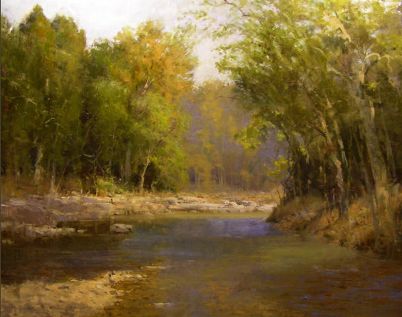
 oil painting of mountain stream by George Van Hook
Fly Fishing in the Mountains               24 x 30"                  Oil

   Green is an important and challenging color. It can vary from deep blue black to pale almost yellow or pink. You have to think of it as being made from many of the surrounding colors, and as an important element in the overall color scheme. Usually I am making my greens by first pulling the blues from the left side of my palette into the yellows on the right. The reds, both alizarin and cadmium are pulled into the top, and white is kept to the side as needed. I keep viridian on the palate as a boost, and have found that at this time (Spring) I keep a permanent green light for that crazy electric green that is the color of emerging leaves. OK, this is just a start on the mystery of mixing color...

Marc Hanson

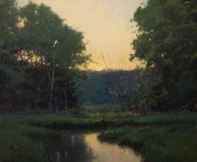
oil painting of meadow and stream at sunset, by Marc Hanson
Summer Colors                    20 x 24"                         Oil

   My greens are made with ultramarine, cobalt blue, cadmium yellow deep, yellow ochre, and then a variety of reds. In the greens on this painting, there are a lot of cool dark greens made with alizarin crimson, viridian, ultramarine blue and the two yellows. I don't use cerulean, but Marc Dalessio gets great greens, so it must work.

Kim Casebeer

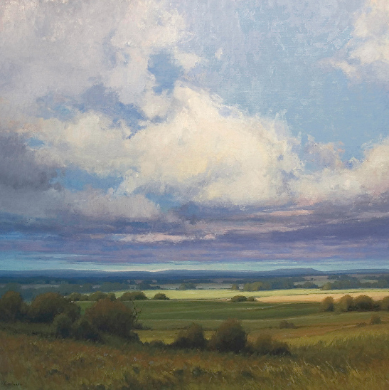
oil painting of midwestern landscape by Kim Casebeer
Chasing Light                     36 x 36"                         Oil

   My palette varies slightly depending on where I am, but typically it is at the top: titanium white, cadmium yellow lemon, cadmium yellow deep, yellow ochre, transparent orange, cadmium red light, alizarin permanent, burnt sienna, and asphaltum. On the left side from bottom to top:  ultramarine blue, cobalt blue, viridian, and permanent green. I keep these on my plein air palette and usually keep my studio palette to these as well. Sometimes I add a few to my studio palette:  cadmium green, cadmium orange and occasionally sap green. These are all Gamblin colors. A few of them are particular to Gamblin such as transparent orange and asphaltum. Gamblin makes some great transparent colors. I found cadmium orange to be too cool and harsh for me so I use their transparent orange instead because it warms up a green mixture nicely. I also use it with blues to make the green color we see toward the horizon in the sky without it really going green. Asphaltum is a nice earthy transparent brown color. I usually start finding the values in my paintings with a mixture of asphaltum and ultramarine blue. Another Gamblin color I sometimes use is transparent earth red which is a nice alternative to burnt sienna.

   When I mix greens, I first choose a yellow and blue to get started. Then add red to modify or gray the color depending on if I'm mixing a green for the background or foreground. I usually add alizarin permanent (cool red) to background greens and cadmium red light (warm red) for foreground greens. I don't reach for tube green at first because I find the mixture to feel more natural without them. Going from the back in this painting, there is more red (alizarin permanent) and less yellow in the mix to make grayed down greens. Toward the front, I will add more cadmium yellows to the mix, a little less red but it is cadmium red light. This intensifies the colors in the foreground. I also reach for Gamblin's transparent orange when I want to warm up a yellow-green such as the greens in the foreground ground plane in this painting. I will usually reach for tube greens when I want more intense color. That often happens in the foreground as well as toward the end of the painting. I tend to build up my painting, working a little grayer first, then pushing contrast and intensity at the end. I like this way of working because it lets me see the painting as a whole before I make decisions about where I want to push color and value changes. Those final little bits of color are very important so I tend to spend a lot of time standing back and looking while I'm finishing a painting.

John  Louder

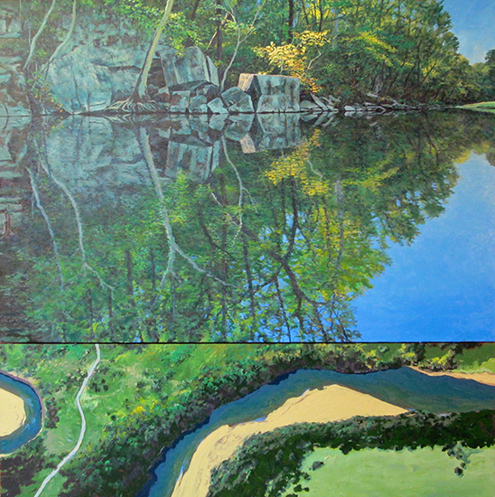
oil painting of forest stream by John Louder
Google Land View Buffalo River          72 x 72"          Oil

   When I am oil painting I only buy two greens, chrome oxide green and pthalo green. I don't usually use them straight out of the tube but will when the color is appropriate, which is not very often with the pthalo. I usually buy professional grade oils from Daniel Smith or Utrecht. What is probably most important to me is to change the temperature of the green as you change its value and try to find reds and browns to contrast whenever possible. I will often start a "green" painting on a venetian red under-painting. My mixing of two colors to make green includes ultramarine blue, pthalo blue, cadmium yellow medium, hansa yellow light, and yellow ochre. In the end every color on my palette is used to tint, warm, cool or neutralize my greens.

Roger Dale Brown

oil painting of Hapeth River Tennessee, by Roger Dale Brown                                                           Hapeth River Spring                48 x 60"                         Oil

   I typically do not have a green on my palette. I took green off early in my career. Tennessee is nothing but green in the spring and summer. If your paintings don’t have a variety of greens they will fail. Early on when I did use green, I noticed all my greens looked the same. I had the bad habit of dipping into the same green for all my greens. My solution was to get rid of the green on my palette and mix for the object I was looking at, hence giving me the variety I needed to create interest in my painting.

   I mix the local color with either lemon yellow or cadmium yellow light or medium and ultramarine blue, cobalt, or cerulean, then tone the color with cadmium red, and/or burnt sienna. I adjust until I come close to the object I'm mixing for. The next area of green I am mixing for, I use the existing green and bend it with yellow, blue, or red, until I come close. The key to painting like this, is keeping your values close, and not varying the contrast within the foliage of the mass of trees.

Howard Friedland

Springhill Morning by Howard Friedland
Springhill Morning                    30 x 40"                    Oil

   I have viridian green on my palette. I like it better than other tubed greens because I feel it is more versatile than other greens. It can be a very cold green when mixed into white. It can look almost blue and I use it in skies very often. When you add yellow to it, it becomes a very warm spring green like sunlight on grass. You can bend it warmer or cooler by adding the analogous colors (colors to either side of green on the color wheel) blue-green to cool it or yellow-green to warm it up. If you add some complementary color to it like red, red-orange or red-violet you can reduce the chroma and gray it down according to how much you want to reduce the intensity. Another way to cut down on the chroma of pure viridian is to mix it with yellow ochre, or, for a darker tone, raw or burnt sienna. Earth colors are great for greying almost any color.

   I find that other tubed greens, for the most part, lean on the warmish side. I find that I can't get the clean cool luminous effect that I can with viridian green. Some would say use phthalo green. Yes, but I find it a little too acidic for my taste. That said, it is important to note that all color is relative and you really can use any type of green to create whatever effect you like if you are aware of the colors that are around it and how they interact with each other. When I paint a scene with a lot of green, I always compare one green to another and ask myself  "Is it warmer or cooler, lighter or darker, brighter or duller than the other greens in the scene".

   I also like to use any combination of blues, yellows, orange, reds, to get a myriad of greens. Even yellow and black make a lovely grey-green. The key is to experiment and use your creativity to solve the visual problem at hand. Use whatever works to give you the effect you are looking to achieve.

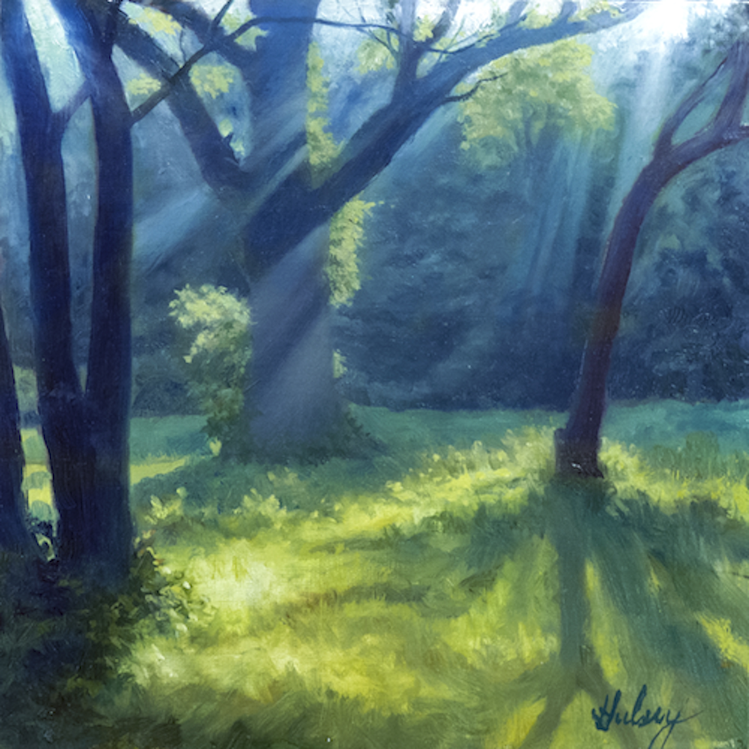
John Hulsey

oil painting of sunlight, trees and meadow, by John Hulsey
Meadow Walk IV                       30 x 40"                            Oil

   Over the years I have slowly changed my greens to adapt to my increasing sensitivity to the colors in the landscape. I use these same greens in my studio work. When I began teaching myself how to paint in 1968, I learned how to mix greens from blue and yellow. Just a few years ago I began investigating how the Old Masters mixed greens from yellow and black, and added that to my repertoire. Yellow ochre and black, especially, makes wonderful smoky dark greens and grays. Generally though, I prefer to mix greens from cobalt or ultramarine blue with either cadmium yellow light or lemon, or cadmium yellow medium. I can make a very cool mix from lemon yellow and cobalt and even add white for more coolness, or warm the greens with ultramarine blue and cadmium yellow medium, which makes a nice muted warm green. I use cadmium red light to further gray and warm my greens, or alizarin crimson for a cooler green-gray. Cadmium orange is great for modulating into those warm cedar tree tones we get in the Winter. I generally start a painting by identifying the dominant green masses in the foreground, and then mix a color string in my palette from warm to cool of that mass color. In this way, I can simply pick up the correct temperature and modulate the value to match. Warm greens approach from the foreground and cooler, lighter-valued greens recede in the background. The majority of my painting will be composed of colorful grays, with just touches of higher chroma colors at the finish to bring it all together. Tube greens I use sometimes: sap green, viridian.

Annie Helmricks Louder

arylic painting of forest and creek, by Annie Helmricks Louder
Steel Creeks Cathedral               30 x 40"                    Acrylic

   About green. I thought I understood all the colors--but Missouri had to teach me a thing or two about green before I could even start to begin. With pastels I never blend but only layer so a wide range of colors is pretty important. Oils, acrylics and watercolors are different though. My basic palette for green consists of warm and cool blues mixed with warm and cool yellows. Pthalo green is the extra spice for power but I always desaturate it with other colors around my palette - even using reds sometimes. Sap green is nice and for the desert, chrome-oxide is pretty essential. If I want a real charge, I mix the greens with a touch of any of the cobalts - especially in watercolor. Have to admit a Daniel Smith's occasional treat (like Green Gold) can be a real treat once in a while.

   So in summary,  the warm/cool blues and greens with pthalo are the real powerhouses. I pay attention to transparency for glazing.

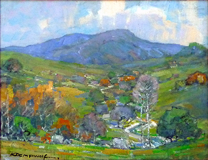
Karl Dempwolf

oil painting of California mountains, by Karl Dempwolf
Where Cattle Graze                14 x 18"                            Oil

   Green is one of the colors I really love, and since we only see it for just a few weeks in the Spring here in southern California and then not again for the rest of the year I will use it, usually NOT right out of the tube. I love the Utrecht Brilliant Green. It has more body than the Windsor Newton green and so when I want a punchy green I start with the Utrecht. I will mix a yellow light in it to punch it up even more, or a yellow deep to bring down the intensity of the green. In the attached image there are a variety of greens, the brightest being under or near the California Live Oak on the right and then repeated in the tree towards the far left. The green gets toned down a bit as we head towards the horizon, there are already areas that are changing towards the familiar light brown found all over the southern part of the state. Even in the middle of Summer I will include a little green under or near the large oaks, since they gather the light morning mist and drop it keeping some of the green in the shadiest areas.

Marc Dalessio

oil painting of vineyard in Tuscany, by Marc Dalessio
The Side of a Farmhouse in Chianti           31 x 40"             Oil

    I don't use a green. I mix my own. There is a short video on youtube
where I talk about greens: http://www.youtube.com/watch?v=NCIjG53VaIk

(excerpted from his video, "Chianti Lessons")
   We'll quickly talk about greens. Ultramarine and cadmium yellow which is going to be a very, very vibrant, a very dark green. In fact if you want to make the darkest possible green you can get, you add a bit less of the cad yellow, a bit more of the ultramarine and a touch of the cadmium red and that's your darks of the cypress tree.

   The second green is ultramarine and yellow ochre, which you would think would be darker than the cad yellow because the yellow ochre is a much darker value but in fact even a good ochre like this has a chalkiness to it so if you look at this green compared to that green it's gone much grayer, much chalkier . . .You use a tiny bit on occasion for olive trees, but to get that olive green I have to add a bit of cerulean and a bit of white to it and then you can even knock it down a bit with some of the vermilion. So there's your olive color.

   The next two greens are cerulean and yellow ochre and this is my favorite green of all. I love this green. This green is the green of all the distant oak trees. Basically any distant large tree, the distant olive trees, the distant cypress - if you add a bit more ochre to it, it is the perfect color for a cypress tree in the sunlight. It's a surprising green. Look how dark it is considering it is such a light blue to start with. So we use a lot of the cerulean and ochre.

   The fourth green is cerulean and cadmium yellow. This is your grass green, your fig tree in sunlight green. If you want to get the grass green you'll add more yellow and more white. These are the base greens. Obviously we can knock them down with red, take them grayer depending on the sunlight. If there's an evening light you'll add more red or orange.


For more info about mixing colors,

See: Secrets of the Old Masters - Mixing Beautiful Greens from Black,

All artwork copyright the artists.


Copyright Hulsey Trusty Designs, L.L.C. (except where noted). All rights reserved.
Become an Artist's Road Member Today!

The Artist's Road LogoClick here to become a Member and enjoy access to all the in-depth painting and travel articles, videos and tutorials. Guaranteed!

Search the Site
Perspectives

Not ready to become a Member yet? Subscribe to our free email postcards, "Perspectives". Enter your email address here.

The Artist's Road Store
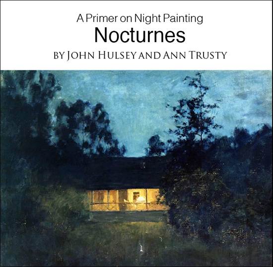
A Primer on Night Painting - Nocturnes

Nocturnes - A Primer on Night Painting

Filled with inspirational examples by the masters of nightime painting, this little book is sure to fire up your creative energies. Never tried painting at night? We show you how it's done with a step-by-step-oil demo and a tale of night painting in the wilds of Rocky Mountain National Park. The Primer on Night Painting - Nocturnes is a 7 x 7" PDF download with 40 pages of text and images. It includes a gallery of paintings by masters of the nocturne, information to inspire and encourage you in your plein air nocturne painting, an illustrated step-by-step demo and tips for working in pastel and oil. Also available in a softcover edition. Check out the tools and other products that we use in our own art and travels in The Artist's Road Store. We only offer things for sale that we enthusiastically believe in.

Save

Save

Save

Save

Save

Save

About Us

Photograph of John Hulsey and Ann Trusty in Glacier National Park
We are artists, authors and teachers with over 40 years of experience in painting the world's beautiful places. We created The Artist's Road in order to share our knowledge and experiences with you, and create a community of like-minded individuals.  You can learn more about us and see our original paintings by clicking on the links below.
About Ann
     About John
 Hulsey Trusty Studios