The Artist's Road Watercolor TestThe Artist's Road Watercolor Test
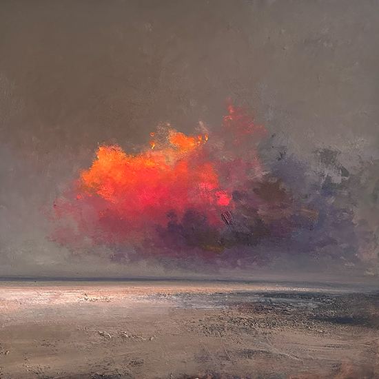
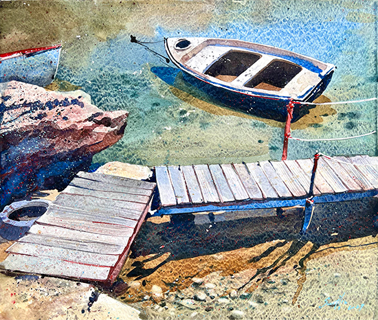
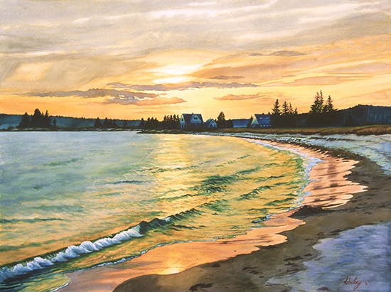 Calm II 40 x 53" John Hulsey One of the truly confounding characteristics of watercolors is their tendency to change value and intensity when dry versus when wet. Knowing how the colors will change when dry is essential to painting with watercolor for one simple reason: the medium demands speed in execution to reach its full expressive potential. Working fast, wet into wet, is flirting with disaster, moment to moment, stroke by stroke. Working wet on dry and "chasing the bead" down the sheet, also leaves little time for second-guessing a color mix for intensity or value. If this is not maddening enough, the same colors can look and even behave quite differently on different types of watercolor paper. Change paint manufacturers and you further change the way some reliable colors behave. So many variables—so little time! This is probably why artists often claim that watercolor is hard to learn, and why there seem to be fewer professional watercolorists than oil painters out there.
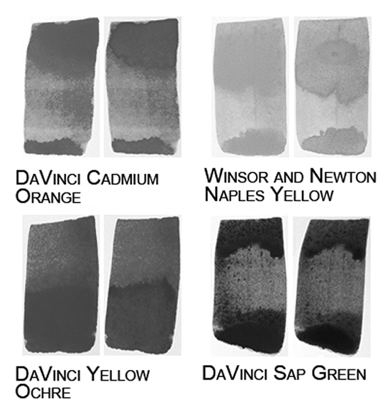
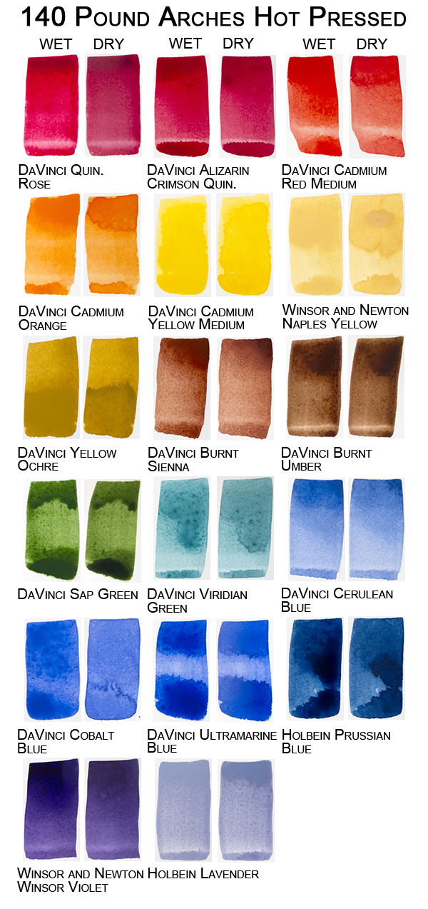
The real truth is, that once one learns the behaviors and characteristics of the medium, it is actually much easier than painting in any other medium. Watercolors, properly handled, will do most of the work for us, especially by eliminating the laborious mixing of values and shades in color transitions as is required in oil or acrylic painting. Learning those behaviors can take a lot of time and many failed attempts. We decided to help shorten that learning curve by testing our modified split primary palette of standard colors on three different surfaces of Arches watercolor paper to show the difference between the wet and dry paint. Over the years, we have tried most of the available professional watercolor papers and found that Arches suits our temperament and style of working better than any others. Each person must do the same, but using a reliable, high-quality paper is a great starting point. This is by no means an exhaustive test—the combinations of different papers and manufactured colors present nearly endless possibilities. However, it is a useful illustration of what to expect from these particular well-known materials which you can use as a guide. The Test For our test, we set up a photo light booth with diffused, color balanced lighting shot with a DSLR camera exposed to a custom white balance. Unfortunately, putting these colors on the low-resolution web changes them through jpeg compression and conversion to the sRGB color space. For that reason, we created uncompressed RGB pdf documents of each chart which you can download and print off on your home printer. They will fit on an 8.5 x 11 inch sheet of paper. We recommend using high-quality, matte surface photo paper in your printer to get the most accurate color rendition. We tested two of the most popular Arches paper weights - 140 pound and 300 pound. Both are sold in sheets or blocks, although a block of the heavy 300 pound seems superfluous because of its inherent stiffness. We tested two surfaces in the 140 pound - Hot Press and Cold Press. The hot press surface is very smooth and slightly resistant to water while the cold press surface has some texture to it and accepts most colors readily. Wetting any of these surfaces with clean water increases their absorbency at a loss of color intensity and value. To keep things clear, all samples are on dry paper, applied at full intensity. In the test above, most colors tended to dry lighter and exhibit less chromatic intensity on the hot press sheet, but a few appear to get darker! As you can see from the black and white below, Cadmium Orange, Naples Yellow, Yellow Ochre and Sap Green all gained value when dry.
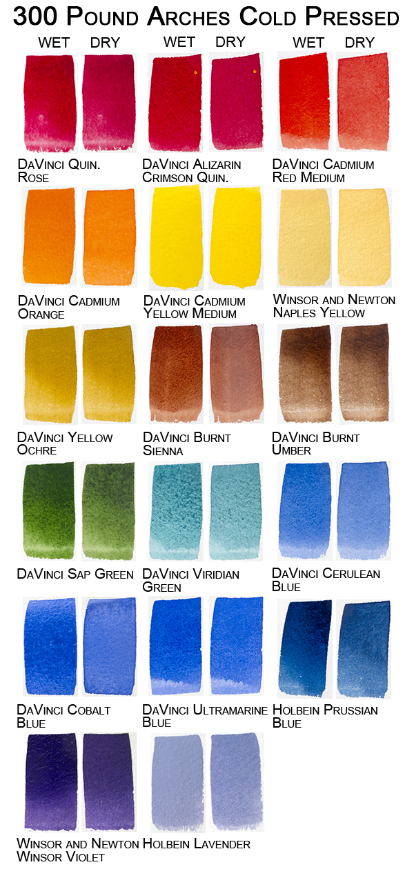
 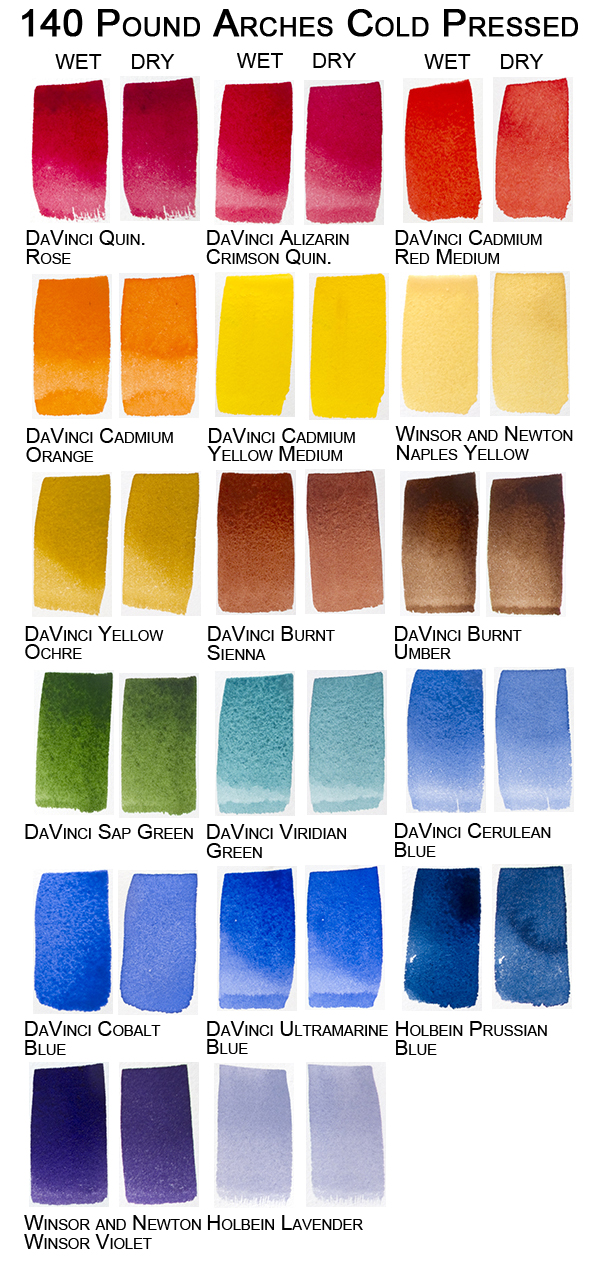 Arches 140 lb. cold press is perhaps the most popular weight and surface. It is a very stable sheet, with moderate texture and absorbency, and benign, reliable characteristics. Because of that, our colors do not undergo radical changes when dry, with a few notable exceptions. Like the 140 lb. hot press, it too must be stretched or purchased on a block in order to prevent buckling when wet. The first thing we note are the chromatic shifts in the Quinacridone Rose, the Alizarin Crimson and the Cadmium Red. They actually seem to appear cooler when dry, and the Cadmium Red, in particular, has lost value. The sedimentary earth colors show the least amount of chromatic or value changes, while the blues tend to exhibit the greatest variability in both categories. Cobalt, Ultramarine and Prussian Blue changed so dramatically that they almost appear to be different colors, especially the Cobalt. This can cause problems for the painter trying to express color intensity in the finished painting while maintaining the immediacy of a fresh, one-go wash! When Cobalt or Ultramarine is going to be employed at full intensity in the finished piece, the wet, mixed pool of paint just has to look way wrong for it to come out right. Arches 300 lb. cold press is not for the faint-of-heart painter. It cannot rightly be thought of as paper at all—it is more like working on a very heavy, stiff fabric. All of the Arches papers are 100% acid-free cotton. The 300 lb. is their best paper, in our experience. It does not need stretching and therefore it is not only portable, but ready to paint at a moment's notice. But, this paper has a strong personality—a little demanding perhaps, but delightful once one gets to know it! The propensity to hold moisture down inside the thickness of the sheet can really throw off any painter not used to it, and sometimes causes our students to throw up their hands in surrender. But surrender is just what is needed when working on this marvelous stuff. Give full attention to what's going on start to finish and you may be rewarded with a masterpiece. And if you are observant, attentive and focused, this paper will paint part of your picture for you! All it takes is a little practice.
Once again we see that the usual suspects lost chroma and value, especially the blues, and the Quinacridone-based reds got chilly as they dried. Surprisingly, both Cobalt and Ultramarine blues exhibited a smaller degree of chroma and value shift on the 300 lb. vs. the 140 lb. Another reason to love this paper. Poor Prussian Blue just can't keep up on anything but hot press, but we love that color, especially for mixing with the earths like Burnt Umber or Sienna. Those mixes seem to stabilize the Prussian Blue so it hangs on to more of its beautiful deep blue-green pigment when it dries. We hope that this test has given you some insight into not only how watercolors change as they dry but also how a different paper affects them. It all comes down to chemistry, the interactions of the chemicals in each color with the organic properties of the paper. As different manufacturers vary the color formulas, perhaps substituting different pigments (like the Quinacridones) for older, more toxic pigments, and, as they mix in different additives, our colors behave differently. One company uses honey as a vehicle in their watercolors, and that makes them a completely different painting experience (and attractive to all kinds of bugs while painting, we might add). Perhaps the best advice we could offer to any student of watercolor is this: keep painting—never give up. You'll get there, and when the understanding of your paper and paint sinks in and becomes part of you, you'll own it. And with that comes the kind of complete confidence which makes watercolor painting pure excitement, pure pleasure. |
Become an Artist's Road Member Today!
Already a Member?Log in here. To renew your membership, log in and follow the links. Search the SitePerspectivesNot ready to become a Member yet? Subscribe to our free email postcards, "Perspectives". Enter your email address here.
Member ContentFree ContentThe Artist's Road StoreNocturnes - A Primer on Night Painting Filled with inspirational examples by the masters of nightime painting, this little book is sure to fire up your creative energies. Never tried painting at night? We show you how it's done with a step-by-step-oil demo and a tale of night painting in the wilds of Rocky Mountain National Park. The Primer on Night Painting - Nocturnes is a 7 x 7" PDF download with 40 pages of text and images. It includes a gallery of paintings by masters of the nocturne, information to inspire and encourage you in your plein air nocturne painting, an illustrated step-by-step demo and tips for working in pastel and oil. Also available in a softcover edition. Check out the tools and other products that we use in our own art and travels in The Artist's Road Store. We only offer things for sale that we enthusiastically believe in.
About Us
|

 Voices of Experience:Richard K. Blades
 ing Watercolors
 Nocturne Notes
 Inspiration in Monet's Gardens
 The Watercolor Medium
 The Perspectives Archive
