Photoshop for Artists, Part IIIPhotoshop for Artists
Part III 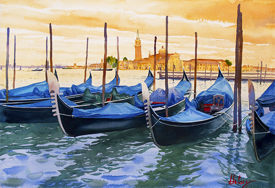 Gondolas on the Grand Canal Watercolor John Hulsey 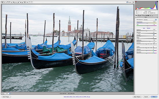 The original snapshot open in Photoshop's Raw Editor Lesson 3 - Using Photoshop Tools to Re-Create Your Inspiration
Relevant Articles: The Artist's Guide to Digital Cameras, Parts I and II Photoshop for Artists, Parts I and II In this installment in our series of How-To articles, Photoshop for Artists, we expand our coverage of Photoshop's magical painting tools. These painting tools allow the artist to remodel and re-color any digital photograph or image into a new vision of the original scene. There is no substitute for working from life, and painting en plein air is essential. When we return to the studio, our sketchbooks and studies are indispensable tools. However, we may also need to refer to the photographs we have taken on site in order to complete larger studio paintings. Digital cameras have their drawbacks, though, the worst of which being that they do not see the way the human eye sees. This tutorial will help you to restore those digital images to your original inspiration. Instead of investing hours to laboriously make multiple color sketches with paint, an artist can quickly try out different combinations of colors, values, edges and light on their images to arrive at the most effective reference for their studio painting. Photoshop is truly the artist's digital sketchbook. In order to take full advantage of Part III in our Photoshop For Artists How-To Series, it is important that you have studied and practiced with the tools, techniques and information in Parts I and II. That being said, let's get to work with your photo the correct way, from Part II: Getting Started As we learned in Photoshop for Artists I, there are a few settings to make so that our tools and screen are ready for us to begin. Once you have selected your image in Bridge by double-clicking on it, it should open Photoshop automatically if it is a TIFF. If your image is in the recommended RAW format, the RAW processing window will open as shown below. If it is a JPEG, you will have to go to File, Open With, Photoshop, or better yet, Open in Camera Raw, which will open the RAW processing window. Once there, look at the multicolored histogram graph at the top right of the window. If you see a bright yellow triangle in the corner of the graph, click it. That will correct any highlight "clipping" (blowouts) in your jpeg and give you a much better spread of values in your image. 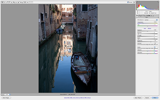 Image open In Raw Editor before adjustments 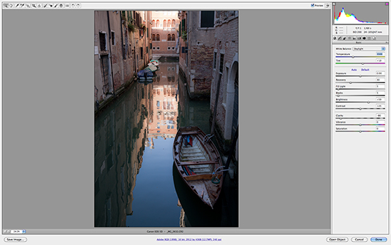 After adjustments to Recovery, Fill Light and Clarity For this lesson, we will touch on a few of the adjustments which the Raw Editor offers. Step One is always to make sure you have an original, unedited copy of your photo stored somewhere. When saving, whether in Raw or Photoshop, simply rename the photo and you will not have harmed your original. The Raw Editor has many advanced controls for adjusting photographs - investigate the menus, play with them or read more about them - they are impressive. However, we encourage you not to make many adjustments here. The changes you make here are "global" changes, affecting the entire picture. This is not generally what we want to do in our photos. What we want is to be able to "paint" our adjustments in those individual areas which need them, not the entire picture. In the photo above of a canal in Venice, I applied three small global adjustments to my image - adjustments not available in Photoshop. Recovery restores details in highlights, Fill Light restores detail in shadows and mid-tones, and Clarity either sharpens or blurs details for a soft, dream-like effect. These done, I click Open at the bottom right to launch Photoshop CS4. While CS5 and 6 have expanded palettes of tools, the basic principles and tools used here still apply.
The images which follow are cropped screen shots of the Photoshop workspace. 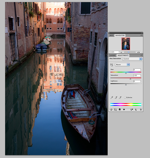 First, I opened all the Panels needed from the Window menu in the top toolbar: Adjustments, History, Navigator, Info and Layers. We always start by duplicating the Background layer (right click, Duplicate & rename if you choose). My first adjustment in this image is to add more Saturation to the colors to make the picture have more color intensity. In the Adjustments panel I selected the Saturation Tool, which creates a new adjustment layer, and pushed the Saturation slider up to 30, globally affecting all the colors.
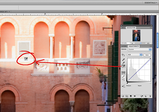 My very next adjustment, before anything else, is to remove any color cast and balance the colors. I do this by selecting the Curves Tool from the Adjustments Panel. Within the Curves Tool menu you will see three eyedroppers on the left side. These correspond to Highlights, Mid-tones and Shadows. If you recall, we made a special point of setting up the tolerances for each of those in Part II, The ABCs of Color Correcting. I clicked on the bottom, or Highlight eyedropper to select it, and then zoomed in to 150% to select a white area and clicked the dropper in that area. Immediately the colors became better balanced and much of the blue cast was neutralized in the photo. Easy! I also made a separate Curves adjustment to the Shadows, using the Shadows Eyedropper, on a separate layer, to open up those dense areas (not shown). By the way, to Undo any adjustments, you can either choose Edit, Undo, or Edit, Step Backward, or, with the History Panel open, just click on the step before.
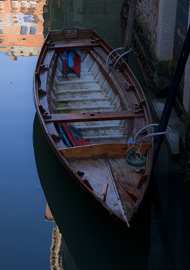 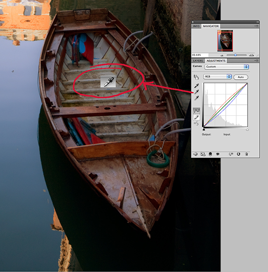 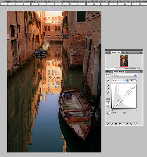 In the two shots above, it is clear that the boat on the left has a strong blue cast, which I wished to minimize. The easiest way to do this is to select the Curves Tool again, click on the Mid-Tones Eyedropper and click that in the image wherever desired. The improvement to the boat is obvious, but because this adjustment is applied globally, the rest of the image suffers by becoming too warm toned. What to do? Now is when the real fun begins as we learn to paint in Masks to isolate our changes to only those areas we want. In the two shots above, it is clear that the boat on the left has a strong blue cast, which I wished to minimize. The easiest way to do this is to select the Curves Tool again, click on the Mid-Tones Eyedropper and click that in the image wherever desired. The improvement to the boat is obvious, but because this adjustment is applied globally, the rest of the image suffers by becoming too warm toned. What to do? Now is when the real fun begins as we learn to paint in Masks to isolate our changes to only those areas we want.A mask can be applied to any layer, and as you remember from Part II, layers are like sheets of acetate with whatever portion of our image that we choose to reveal repeated on that layer. By creating a mask, we are selecting only a portion of our entire image for that adjustment, on that layer. To test this result, simply turn off the eyeball symbols next to each layer and you will see how it works. Any of the tools in the Adjustments Panel can be painted in any amount onto an image. Just remember to make sure that each adjustment is on its own separate layer. Painting in Masks A mask in Photoshop is represented by a solid, opaque black shape, either partially or completely obscuring the image below it. When we paint on an image after applying the mask command, we are basically painting white onto the mask, which makes that painted area transparent to the adjustment below it in whatever percentage of Opacity we have used with our brush. We can also use the Erase tool to erase a mask with the same controls as a painting tool to achieve a similar effect. More about the Eraser later on. But if our image is covered by black, how can we see where to open it up to show our adjustment? For convenience, neither the black mask or the white paint is visible in our image. It is visible in the little box in our layer in the Layers Panel. The folks at Photoshop created an easy technique to solve this issue and our professional photographer friends showed us how: 1. Make an adjustment (just one at a time!) on a separate layer above the Background copy. 2. In the top toolbar, choose: Edit, Fill. When the little separate menu panel opens, select Background color. Make sure that the Background color on the left side vertical toolbar is set to Black and the Foreground is set to white first! If they are not, just toggle the little black and white box symbols to reset them. 3. Immediately the image will revert to its previous state, making the adjustment seem to disappear, but it hasn't. The mask is now applied, although you can't see it. Where you can see it is in the little square in the Layers panel - the blue layer you are now on. 4. Using the mouse, or far better, a stylus pen on a digital pad, select a tool to paint with from the vertical toolbar on the left side of the Photoshop workspace. I generally use a brush or a pencil. To switch between the two, hover and right click. 5. Holding your mouse or stylus over the image, right click to open the tolerances menu for that tool. You will see that you can set both the size of the tip and the hardness. Additionally, in the toolbar at the top of the workspace, you will see adjustments for Opacity and Flow. These are very important and require a little practice. Note: the softer the tip, the larger the area the "overspray" affects. It is sometimes easier to set the Opacity very far down, so that, with a soft tip, one can slowly build up an effect until it looks right. Don't worry about getting it perfect the first time, Photoshop allows you to readjust both Opacity and Fill of each adjustment layer in the Layers panel. 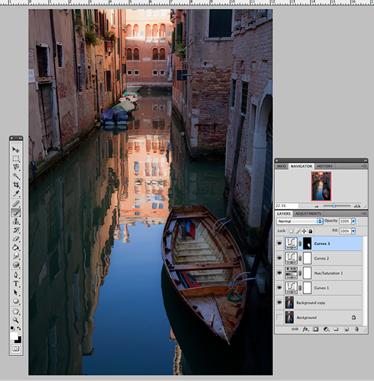 Image after Curve Mask was painted in boat. Mask is visible in Layers Panel. For this image, I selected the brush, set to a convenient size to paint open the mask only on the boat, at 100% Hardness, 30% Opacity. I knew that I wanted to preserve the blue colorcast on the upper parts of the boat, but eliminate the blue cast in the bottom and right side of the boat. At 30% I could slowly develop the warm colors in the boat until I was happy. The hardness restrained my work to exactly where my stylus was. Again, at any time, I can make more adjustments to this mask in the Layers panel for that layer when it is highlighted in blue. No worries. 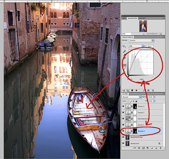 To illustrate how the mask works, I made a screen shot of this Curves adjustment where I exaggerated intentionally the lightness effect to highlight the shape I painted in this mask. You can clearly see that only the area I painted, the boat, has been affected by this adjustment. Then, I used my stylus (or mouse) to grab the curve and pull it back down to a pleasing level. 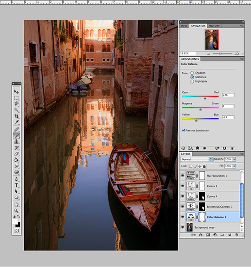 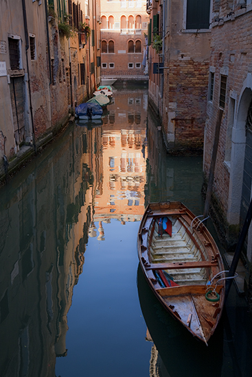 Above left, shows the global Color Balance adjustment I made, before the mask was applied. I pushed up both the yellow and the red sliders further than where I wanted to end up, knowing that I would gradually paint these colors in the image wherever I felt they were needed. On the right is the image after it was painted in. Note: If you feel that you went too far or applied too much of an adjustment, you can repaint the mask with black to remove the previous strokes. To do this, go to the vertical toolbox on the left, and switch the position of the white and black squares by clicking the double-pointed arrow right above them. As you repaint, the previous strokes will disappear. Just remember to switch them back again before you apply more adjustments! At this point, I was pretty satisfied with the adjustments I had made, so I decided to make this image into a more compact file and save it. We can either save images with all the layers expanded, or we can choose to merge the layers, merge only the visible layers, or flatten the layers. If you are planning to ever undo some of the adjustments or modify them, or work on the file another day, save the image with the layers intact. It will be a large file. Usually this is not necessary, so I generally flatten the image, which produces the most compact file. Once saved and the file closed, this cannot be undone. Changing the Shape of the Image Saving does not close the image, and I had decided that I wanted to change the dimensions of the original image to make the image a little less vertical. To do this, we have to add more Background image space, referred to as Canvas. (This requires that the layers already be collapsed through a merge or flattening.) Go to the top toolbar of the workspace and select Image, Canvas Size. The menu seen below will open. 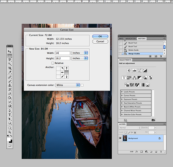 The menu shown above allows you to select in which direction, or to which edge of your image you wish to add Canvas, the size of the expansion and the color. Be sure to match the original Background color of your image, usually white. (You can specify a transparent canvas or any other color if you wish, but then the new canvas would not match the Background color of your original image, which should always open as white). Click OK and magically the new white area will be added to your Background. I decided to stretch the left side of my image so that it would fill this new area. 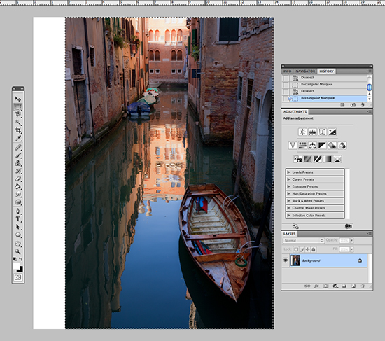 Above you can see the Marquee selection tool applied to the image - it looks like "crawling ants" when it is active. This tool is found at the top of the vertical toolbox at left, and is represented by a dotted box. To use it, I click on the tool to select it, and then click on the upper left corner of the original image here and drag down to the lower right while holding the button down. Then release, and the ants start crawling, indicating that the selection is active and ready for the next step. 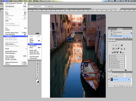 To expand my image, I decided that it would be fine to simply Distort the image by stretching it. After all, this is only reference for a painting, not an exhibition piece. To do that, I went to the top toolbar, selected Image, Transform, Distort. This added little box-like handles to the active selection Marquee. By clicking and dragging the left side handle, I stretched the entire image to the left, filling the new canvas and reproportioning my image nicely. 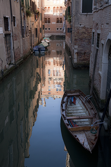  On the left is my original, ho-hum photo. The right-hand image is the final adjusted and stretched one. Which one looks more interesting to you? Now I can use this image to develop a painting. But Wait, There's More!
Now that my image is pretty well adjusted to my vision of what I would like to create, it's time to play around a bit with a few of Photoshop's 98 different filters. There are even more filters online that we can download and add, but for now we'll stick with a few of the standards. I often paint a little Blur into my images so that they don't stay so detail-heavy. That is one of the main problems with cameras. They often record too much detail everywhere and therefore do not resemble how we really see. I always make a duplicate of my Background layer first. Then I go to the top toolbar and select Filters, Blur, Gaussian Blur and from that menu, move the slider in the preview window until I like the amount. Click OK and the effect is applied to the entire image. Note that you can Fade the effect in the Layers panel using the Opacity or Fill Sliders. To make this tool really useful, try this trick: Select the Eraser from the vertical toolbar. Notice that you now have all the extra adjustment features of the brush tool along with an "Erase to History" option. I used the eraser to gradually and selectively remove the blur from parts of the boat so that it was sharper but the background was blurry, just like it was when I saw it in Venice. As you erase, you can see the image returning to its original sharpness in whatever amount you have set in the tool controls. My erasing inside the boat also created another kind of invisible mask - an area where future filters would have no effect. You can also see this kind of mask in the Layers panel for that layer. Perfect! Now I could try other filters without having to mask off the boat each time. 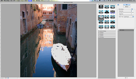 The shot above shows the Artistic Filter Menu with my image open in it. Notice the effect of my erasing of the previous Blur filter, which also erased the image on the Background copy layer. The checkerboard indicates that there is no Background color left where I erased it. Glad I made that duplicate of the Background! Each new filter has a set of tolerance controls which allows us to set the size of the effect or brush, and the intensity or detail level of the effect to create an infinite range of special visual effects. 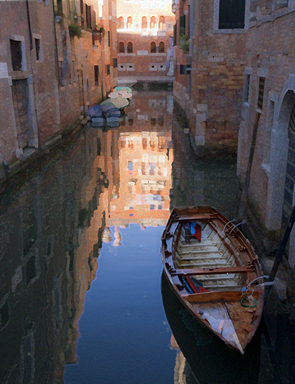 Paint Daubs is one of my favorite Filters and simulates a painting surface, but should be used with restraint. Notice how the boat is largely unaffected because of the erasing procedure in the previous Blur step. Then I applied the Angled Strokes Filter over the top of Paint Daubs to see what would happen:  The image is getting more painterly with each filter. You can decide to apply filters separately, or just add them on, as I have done here. Just for fun, I decided to dump my erasing mask layer and just go full image from here on. The next filter I wanted to try was the Water Paper filter: 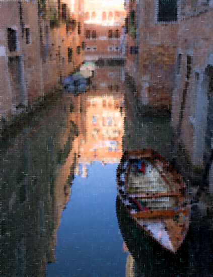 This has a nice impressionistic look and I made a mental note to play with this one again. I went to the top toolbar, Edit, Undo to delete the Water Paper layer and return to the previous image before I tried the next filter. I could have also used the History panel to back out the last step. In Photoshop, there is always more than one way to do something. There is an Artistic filter called Sumi-e, and I was curious to try that out. I think you'll agree that it has a wonderful way of abstracting an image: 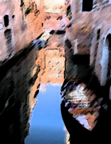 We've come a long way from my original, rather dull photo to this level of abstraction and movement, and we hope that this tutorial has served to introduce you to the great potential for image manipulation which Photoshop contains. It is not just a tool for photographers, but a powerful set of artists tools, just like our brushes and palette knives, for creating personal imagery. Photoshop works hand-in hand with our plein air painting and is indispensable to making the most of our reference photos taken during our painting travels. We use it to recreate our visions of a certain place and light and sometimes create brand-new visions from our photo reference material. What's next? Read Reflection, Venice - Turning Photo Inspiration into a Work of Art to see John's oil painting study done from this photo. Stay tuned for our next installment in our series Photoshop for Artists, Part IV. We will show you how we use Photoshop to combine images from separate photos, remove image elements, flip objects, and remodel the original lighting conditions to suit our personal vision.
|
Become an Artist's Road Member Today!
Already a Member?Log in here. To renew your membership, log in and follow the links. Search the SitePerspectivesNot ready to become a Member yet? Subscribe to our free email postcards, "Perspectives". Enter your email address here.
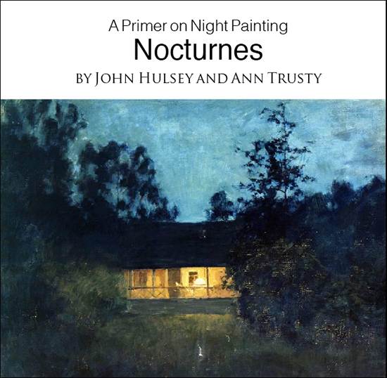
Member ContentFree ContentThe Artist's Road StoreNocturnes - A Primer on Night Painting Filled with inspirational examples by the masters of nightime painting, this little book is sure to fire up your creative energies. Never tried painting at night? We show you how it's done with a step-by-step-oil demo and a tale of night painting in the wilds of Rocky Mountain National Park. The Primer on Night Painting - Nocturnes is a 7 x 7" PDF download with 40 pages of text and images. It includes a gallery of paintings by masters of the nocturne, information to inspire and encourage you in your plein air nocturne painting, an illustrated step-by-step demo and tips for working in pastel and oil. Also available in a softcover edition. Check out the tools and other products that we use in our own art and travels in The Artist's Road Store. We only offer things for sale that we enthusiastically believe in.
About Us
|
 Voices of Experience:Richard K. Blades
 ing Watercolors
 Nocturne Notes
 Inspiration in Monet's Gardens
 The Watercolor Medium
 The Perspectives Archive