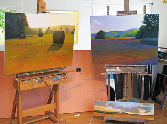
From Plein Air to the Studio - Two Case Studies

| Next
 

From Plein Air to the Studio

Two Case Studies


Summer Brome with Summer Evening, 30 x 40" Oil Paintings, © John Hulsey


   The development of the two paintings illustrated in this article really began as a casual request from one of my out of state collectors who expressed an interest in a set of paintings which would exemplify the landscape of northeastern Kansas at its summertime best. What a plum assignment for an artist who wanders this same turf almost every day searching for exactly those subjects! I have always loved to drive around in the countryside, top down, curious to see where back roads might lead. Over the years they have, more often than not, lead to good painting subjects. This is part luck and part education, for the landscape painter tunes eye and mind to seek out those combinations of light and shadow, shape and line, which excite us in their potential to express that ineffable “there-ness” which can cause universal connections to be made. So it was with these two paintings.

Summer Brome

   Anyone who paints en plein air will tell you that it is an immersive experience. Racing the sun across the sky while attempting to lock in a particular moment of light requires such complete concentration that everything around us—even time itself—is temporarily lost in the effort. This was definitely one of those moments.

   I always start a painting by making a few thumbnails in my sketchbook. This allows me to not only “try on” different views or compositions of my subject, but also to lock the composition in my mind before I commit to a canvas.

Summer Brome Study Step One © John Hulsey   Once done, I quickly paint a schematic of the main elements—the largest masses—on my pre-tinted 10 x 14” canvas panel using a thinned-down mixture of Transparent Oxide Red mixed with some NeoMegilp.


Summer Brome Study Step Two © John Hulsey   The next crucial step is to “grab the light” before it moves on. I get the light on my focal point roughed in for color and value and at the same time, establish a mid-dark mass for comparison. All other values will subordinate to those first lay-ins.


Summer Brome Study Step Three © John Hulsey   Like most plein air painters, I have learned the importance of establishing large masses first, and then breaking those into smaller units as the painting progresses. Mid-tone background masses come next—no details. I focus on accurate color temperature, value and approximate shape—sort of like arranging the cast of the chorus in an opera.


Summer Brome Study Step Four © John Hulsey   The hay bales come next—the main singers in my opera—and I begin to build them from three accurate values from light to dark, paying special attention to their shadows. Shadows move the quickest in the landscape, so I try to put those in at the earliest moment. At the same time I make sure that the ground the bales are sitting on is also accurate, if not finished.


Summer Brome Study Step Five © John Hulsey   Once the bales and their shadows are locked in, I can relax a bit and settle in to refining shapes and edges as I create the wonderful light effects in front of me. I work the misty yellow greens in the background trees and hills before tackling those delicious crepuscular rays cast by the mid-ground trees. This is happy painting.
Notice that at this point I am ignoring the hay bales somewhat in an effort to create a world of light behind them. Along the way I discover a way to mix a sun-filled violet into its complement —cadmium yellow—without creating a muddy neutral. This will come in handy later on in the studio work.

Summer Brome I, 10 x 14", Oil, © John Hulsey   The finishing touches bring me forward into the large tree mass on the left and then onto the bales. Even though the light has moved at this point, the bales are still in shadow, warmly rim-lit from behind and also cooly front-lit by the blue sky above and behind me. That’s the kind of pay dirt—deep shadow filled with subtle color—that a camera can never achieve without losing all that wonderful light in the background. It’s why I paint outdoors - I don’t need the tan! I finished this study with a few suggestive flourishes of grass in the foreground.

Summer Brome Studio Painting

Summer Brome, 30 x 40", Oil, © John Hulsey
Summer Brome                                             30 x 40"                                            Oil

   Painting outdoors or from life is essential for capturing natural light. However, when it comes time to take our quick studies back into the studio, we must change the way we think about creating a picture. With our study and perhaps a photo reference at hand, we can now slow down and consider how to make our painting better, and in these two case studies, bigger. Going bigger represents a magnitude greater investment of time in our subject, and now is the moment to work out in our minds what inspires us, and how better to express that.

   As I thought about it, I realized that, although the hay bales were the main actors on this particular stage, the quality and effect of the light on the trees and hills in the background was also important to me. Often in painting, our backgrounds don’t have to do much more than set the stage for the sopranos and tenors, so to speak. In this case, though, I loved both the bales and the light in the background and my study gave me the idea that I could manage both subjects while combining them into a cohesive visual opera. However, this would take complete focus to pull off. No interruptions.

   I had another big issue to solve as well. In my study for Summer Brome, I never really worked out the bottom foreground and the problem of leading the eye up into the picture. There needs to be a pathway for this, and one can use several techniques to accomplish this. I could simply paint in a real-looking worn path, which adds another element to the composition. Or, I could create a subtle color or value change in the grass. Or, I could create some clumps of grasses which would guide the eye upward. Even a change of light on the ground can sometimes accomplish this. One of these solutions would be the best, so I decided to let the picture tell me and leave the foreground unfinished until that moment came.

Summer Brome, Step One, © John Hulsey   On my pre-tinted canvas, I divided the area into four rectangles to make it easier to layout . Then I drew a cartoon or schematic of the main elements of my composition with a sharp oil pastel.


Sharpened Oil Pastel for Use in Summer Brome © John Hulsey   I like the oil pastel for this because it melts away cleaner than charcoal does in my first thin layers of paint. Plus, I can sometimes work the warm color of the oil stick into my transparent layers of paint.


Large Brushes and Scrapers for Use in Summer Brome Painting © John Hulsey   I like to use a variety of large brushes to block in a painting of this size. The larger the painting, the larger my brushes. I will also use paint scrapers to lay in big passages of paint early on. I begin every painting with the relatively coarse hog bristles, as they leave nice marks and are easier to clean than the finer synthetics and sables which follow. Here you can see an assortment of big flat bristles, set decorator’s long handled flats, a big round sash brush, a big fan and a couple of 1.5” filberts.


Summer Brome, Step Two, © John Hulsey   Using a thinned-down mixture of Transparent Oxide Red and Neo Megilp medium, I began painting by laying down a translucent monochrome wash in the large masses and scumbling some angles and textures for the ground plane. Using a thin mix of greens, I established my darkest darks and then more thickly, my lightest lights in the sky. All other values would fall between these two benchmark values. It is important to keep the darks translucent with lots of bristle marks in them.


Summer Brome, Step Three detail, © John Hulsey   In this detail, I have already begun to paint in the middle-value greens, as that important large mass of color and value will affect anything placed on or near it. You can see that I had to wipe out two hay bales and move them a bit already. Always best to make corrections to design and composition early on before the background is in.


Summer Brome, Step Four, © John Hulsey   With the foreground, middle ground and hay bales solidly positioned and the values, if not the color temperatures, adjusted properly, I was ready to develop the background.


Summer Brome, Step Five, © John Hulsey   In this step, I have worked subtle colors into the sky from cool to warm, giving placement to the direction of the sun. Landscape objects directly in the path of the early evening sun tend to be much warmer in color, with a decided yellow cast to them. Using a mixture of Cadmium Yellow, Yellow Ochre and white for the lightest area, I implied the effect of dusty haze in the background hills. To this mixture I gradually added a gray-green mix to build up the layering of the rim-lit trees. I also worked to retain and perfect from my study the invention of the violet tones on the far right and left sides of the tree line. That colorful gray is a subtle mix of yellow and violet—two complements—and, unless perfectly balanced, tends to go muddy very quickly. This took careful mixing and blending coupled with lots of standing back away from my canvas to judge the success of each stroke.


Summer Brome, Step Six, © John Hulsey   As I began to move forward in space to the mid-ground trees, I let the background dry sufficiently so that I could apply a thin glaze of yellow-orange tone to really give the effect of the summer sun. While this was still wet, I switched to finer synthetic brushes and painted in the rest of the trees, keeping my edges loose and grading my color temperatures out from warm in the center to cooler greens on the outsides. The shadows under all these greens was made up of my gray-green mixture, which appeared cool, but not too cool, in contrast to the sun-lit part of the trees. I was also very careful to create and reinforce those crepuscular light rays flowing around the trees. This effect requires some fancy soft brushwork to make believable.


Summer Brome, Step Seven, © John Hulsey
  Background finished and drying, I set to work on refining the hay bales.


Palette of Colors for Summer Brome, © John Hulsey
Palette mix for the hay bales


Summer Brome, Step Eight, © John Hulsey   In this detail you can see that I concentrated on creating a convincing curved volume by modulating my values and color temperatures and applying textural effects to simulate the hay. Modern baling equipment applies a thin perforated sleeve of polyester around each bale and this makes the bales have a sheen to them which glows and often picks up the blue of the sky. This puts light into the shadow side and creates a beautiful lavender “head”. This plastic also amplifies the rim light on the top edges which makes each bale stand out against the sun in an attractive way. I found the whole effect almost mystical in that dusty warm light.

Showing the Eye Path in Summer Brome © John Hulsey   I waited until the very end of the painting to decide how to handle the bottom of the picture. For this, I decided to suggest a kind of cattle path leading from lower right up to the middle of the canvas before turning right and trailing off into the distance. It was very important to keep my strokes large and loose, and the shadow values artificially light so as not to create a visual distraction from the rest of the painting. Notice that in the entire bottom half of the picture, there is definition only in the shadow of the hay bale—everything else is blurred and soft focus. Never add details that are not needed. In retrospect, I might have put fewer details into the large tree on the left. But, that is for the next painting!

Summer Evening

Summer Evening II, 30 x 40", Oil, © John Hulsey
Summer Evening                                                30 x 40"                                          Oil


Summer Evening Study, 10 x 14", Oil, © John Hulsey   My 10 x 14” study for Summer Evening is a bit larger than the 9 x 12” panels I normally paint outdoors. Working larger takes more time, but also allows me to put more information on the panel - valuable when a larger studio painting will depend on it. I found this scene, as I often do, by chance. I had never been down this road before, but I had seen this barn from another angle and wondered if I might get a different view of it somehow. As luck would have it, a gate opening in the hedgerow gave me a perfect view. Like Summer Brome, this moment was also set in the early evening hours of a beautiful summer day, when long, slanting light helped to create a dramatic scene. To heighten that drama and create a paradisaical feeling I experimented with colors outside of my usual palette. Magentas and lavender-blues went in to all my color mixes along with the bright greens of early summer grass and the warm orangey-browns of fields not yet growing. I liked the result and couldn’t wait to enlarge and develop these ideas further back in the studio.

Summer Evening, Step One, © John Hulsey   As in Summer Brome, I applied a tinted gesso ground to a 30 x 40” canvas to give me a middle value to work over and the opportunity to let some of this orangey-brown color come through in the finish. Great color vibration and energy can occur on the canvas when bits of this complement peek through in those greens and in the lavender-blues. After my oil pastel drawing was established, I began by painting in the sky alla prima so that my hill top edges could be dragged up into it later.

Summer Evening, Step Two, © John Hulsey   Jumping ahead a bit, I put my darkest darks in before I started to block in color all over the rest of the canvas. You can see my grid drawing coming through these thin initial layers. This color-toning process gives me a good feel for how the painting will develop in color value and temperature, and provides me with an education about which color mixes on my palette I will need to pay extra attention to in the finishing stages.


Summer Evening, Step Three, © John Hulsey   Next, I worked the main subject - the background—building the shadows first with translucent tones, followed by the thicker highlights on top. I decided to stick with my experimental lavender-blues and have some fun working those into my greens.


Palette of Colors for Summer Evening, © John Hulsey

   My large glass studio palette mixing area measures 19 x 36”—plenty of room for mixing multiple, long color strings. Having a large enough palette is so important for studio work. Without it, colors get crowded together and can become muddied as a result. The table itself is large enough overall to hold everything I need—thinner, painting knives, mediums and brushes.

   I arrange my colors clockwise from warm to cool and generally employ a split-primary set of colors. Here you can see some lavender blues mixed out for the background colors, using Quinacridone Rose, Ultramarine Blue, Cobalt Blue and Titanium White.

   I mix all my colors with a painting knife, which is easier to clean than a brush and doesn’t absorb any paint. When I feel that I have the color right, I pick up a swab of it on the back of my knife and look at it against my painting. If I think it is correct, I’ll place a bit of it on the canvas with the knife. If it’s still right, then I switch to a brush and paint that area in. I learned this discipline through trial and error over many years and it is a real time saver, allowing me to quickly judge my colors and make adjustments as needed before committing them to canvas.

Summer Evening, Step Four, © John Hulsey   With the background finished for the moment, I moved forward in space and began to develop the middle foreground shadows, as this large mass of color and value would set the stage for everything near it. This area was a challenge, partly because of the size of it, and partly because, as a shadow, it would be quite dark and yet needed to have color and detail in it. I also wanted to use the concentric curves of the field to direct the viewer’s eye upward into the background. Tricky!

Summer Brome, Step Five, © John Hulsey   In this step, I realized that I would have to really tone down the bright streak of sunlight across the bottom of the foreground if I was ever going to get any eye travel up into the painting. I suggested ground plants and textures while keeping the contrast way low. At this point, I also concentrated on painting good shapes, values and colors on the middle ground trees. These had to be painted warmer than the background, yet slightly cooler and lighter than the nearest tree on the far right.

Summer Evening II, 30 x 40", Oil, © John Hulsey   In the final version, you can see the subtle adjustments made all over the painting—a moment we often call, "and then the magic happens”. Often these adjustments don’t even occur to us until everything else is done, and it is a necessary part of the process of making a painting work. While we can decode this effort after the fact, it is impossible to say how it is done in the moment, except to say that it is done by eye, by personal preference and by feel. As you can see now, I warmed up the greens in the distant hillside and trees before adding the livestock for scale and life. I also finished the sky, and cooled off the foreground by toning down the overly red coloration with greens. Finally, I made sure that the light was happening everywhere, including those soft rays coming through from the right side trees. This then, became my vision of a Summer Evening near my home in Kansas.

Save

Save

Save

Save

Save

Save

Save

Save

Save

Save

Save


Copyright Hulsey Trusty Designs, L.L.C. (except where noted). All rights reserved.
Become an Artist's Road Member Today!

The Artist's Road LogoClick here to become a Member and enjoy access to all the in-depth painting and travel articles, videos and tutorials. Guaranteed!

Search the Site
Perspectives

Not ready to become a Member yet? Subscribe to our free email postcards, "Perspectives". Enter your email address here.

The Artist's Road Store
A Primer on Night Painting - Nocturnes

Nocturnes - A Primer on Night Painting

Filled with inspirational examples by the masters of nightime painting, this little book is sure to fire up your creative energies. Never tried painting at night? We show you how it's done with a step-by-step-oil demo and a tale of night painting in the wilds of Rocky Mountain National Park. The Primer on Night Painting - Nocturnes is a 7 x 7" PDF download with 40 pages of text and images. It includes a gallery of paintings by masters of the nocturne, information to inspire and encourage you in your plein air nocturne painting, an illustrated step-by-step demo and tips for working in pastel and oil. Also available in a softcover edition. Check out the tools and other products that we use in our own art and travels in The Artist's Road Store. We only offer things for sale that we enthusiastically believe in.

Save

Save

Save

Save

Save

Save

About Us

Photograph of John Hulsey and Ann Trusty in Glacier National Park
We are artists, authors and teachers with over 40 years of experience in painting the world's beautiful places. We created The Artist's Road in order to share our knowledge and experiences with you, and create a community of like-minded individuals.  You can learn more about us and see our original paintings by clicking on the links below.
About Ann
     About John
 Hulsey Trusty Studios