The Educated Palette (Excerpt)The Educated Palette
 What every painter should know about palette layout and basic color mixing (This excerpt of the in-depth article is provided to you, the readers of Artist Daily, as part of the Artist Daily freemium, The Color Wheel and Beyond. To read the entire article (located in our Members Only content) won't you consider joining us as a Member. Click here to see all the Members' benefits.) This article is in response to the many questions that our students and other beginning painters have asked about colors, color mixing and palette layout. The basic rules of color underlie every color mixing decision an artist makes. Therefore, an understanding of color theory is mandatory in order to grasp more sophisticated color interactions which are often the most critical aspects in a successful painting. We recommend that students investigate the many thoroughly written books on color theory, such as, Colour Harmony & Contrast for the Artist
Without light there would be no color. The colors that we detect are visible because light is illuminating them. If the object we are looking at reflects white light, we see it as white. If it absorbs white light, we see it as black. The absorption and reflection of different colors within light are what create the resulting viewed color. This is the basis of the subtractive color system. Paint uses the subtractive system to mimic the effects of light. Theoretically, one can paint with only the three primary colors of red, yellow and blue (plus white) and successfully produce any color. Mixing equal amounts of the three colors should produce a black, which then can be used to accent, or deepen all other colors. The addition of white will create the tints, or highlight colors. In this way, one could reproduce any color of visible light, in theory. What actually happens depends on which hue of red, yellow and blue one uses, and to some extent, which brand of that hue is used. This three primary color method is an excellent way to begin studying color, and by thoroughly investigating all the possible mixes from these three, a student can gain an advanced knowledge of colors and their mixes that will serve him or her well throughout their painting lives. (An additive, as opposed to subtractive, color system relates to projected light, like that of your computer monitor, where the mixing of differing amounts of red, green or blue light create the visible spectrum. In that system, mixing equal full-strength amounts of RGB together produces white light, and zero amounts of RGB produce black. All other colors are produced by varying the amounts of RGB.)
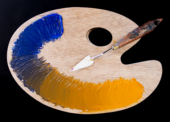
This is an example of mixing the three secondary colors from the three primaries. In this illustration, we have used cadmium red light (twice), cobalt blue and cadmium yellow light, all by Gamblin. The same red was repeated for simplicity.
Cobalt blue to cadmium orange
|
Become an Artist's Road Member Today!
Already a Member?Log in here. To renew your membership, log in and follow the links. Search the SitePerspectivesNot ready to become a Member yet? Subscribe to our free email postcards, "Perspectives". Enter your email address here.
Member ContentFree ContentThe Artist's Road StoreNocturnes - A Primer on Night Painting Filled with inspirational examples by the masters of nightime painting, this little book is sure to fire up your creative energies. Never tried painting at night? We show you how it's done with a step-by-step-oil demo and a tale of night painting in the wilds of Rocky Mountain National Park. The Primer on Night Painting - Nocturnes is a 7 x 7" PDF download with 40 pages of text and images. It includes a gallery of paintings by masters of the nocturne, information to inspire and encourage you in your plein air nocturne painting, an illustrated step-by-step demo and tips for working in pastel and oil. Also available in a softcover edition. Check out the tools and other products that we use in our own art and travels in The Artist's Road Store. We only offer things for sale that we enthusiastically believe in.
About Us
|




 Voices of Experience:Christine Code
 ing Watercolors
 Inspiration in Monet's Gardens
 The Watercolor Medium
 Paintings & Their Places
 Essential Photo Tools for the Landscape Artist