The Colors of the Night: Mastering the Nocturne
|
Next
The Colors of the Night Mastering the Nocturne
We tend to paint nocturnes year round, but for most artists, the first warm, moon-lit nights of spring signal that nocturne painting season is open again. We firmly believe that more painters should try painting at night because there are many learning benefits in the practice for an artist. For instance, darkness forces us to focus on the large masses first. That discipline helps us to see the daytime world with greater clarity. At night we also learn to create simplified compositions which are strong in design instead of superfluous details. That skill improves all of our paintings. We learn how to use and exploit a limited color and value palette to suggest spatial depth and form.
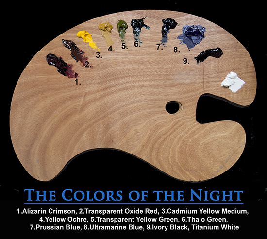
All of the truly accomplished painters whose work we admire have these skills well in hand but it may have taken them years to master them. What an opportunity, then, is the nocturne! Like anything, it takes some trial and error to figure out the palette colors and the technical approach to night painting, so we decided to give you a "leg-up" by introducing our nocturne palette colors. We are illustrating here a larger set of palette colors than one might normally need, to try and cover a variety of different lighting situations —especially city street lighting which can vary these days from yellow to bluish in cast, depending on the type of lamp. Transparent Yellow Green, Cadmium Yellow Medium and Ultramarine Blue are optional colors.
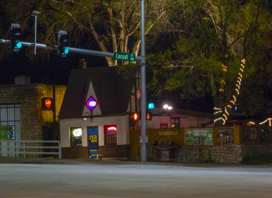
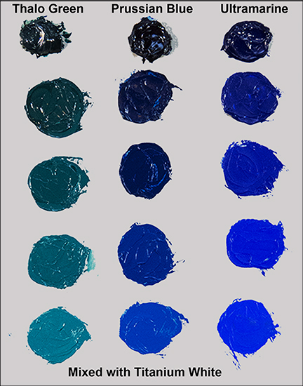
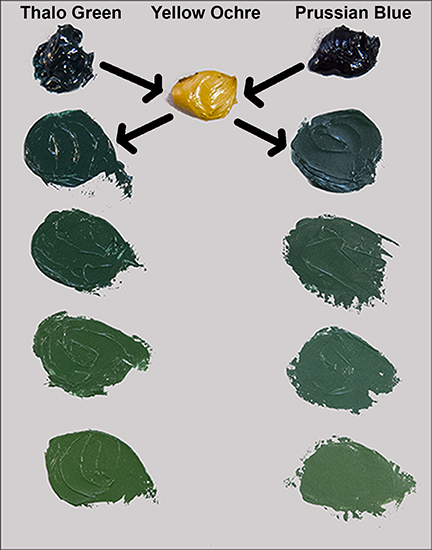
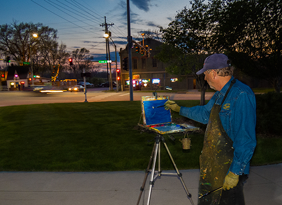
I chose to paint the interesting little high-peaked building which may have been a gas station in the last century, but which now is a bistro. It was a challenging subject because of all the different colors of lighting, from neon, to halogen floods, white Christmas lights, traffic signals, walk lights, and both sodium vapor and LED street lamps illuminating the busy intersection! A cornucopia of light temperatures and intensities. While it may be tempting to merely snap some photos and then try to paint the night scene back in the studio, this is a foolish assumption. Some modern digital cameras can take remarkably good photos at night—especially from a tripod, but they will bear little resemblance to the scene as the eye can see it. The average digital camera sensor (eye) is designed to capture light in only 255 steps of value from pure black to what it registers as pure white, and these only in a limited range of intensity. But the camera is nearly blind in the dark. Shooting at night, we are forced to manually increase the ISO exposure values up so high— above 600—that little speckles of color (noise) appear in all of our darks, while the lightest areas tend to have no detail in them at all. If we try to lower the ISO and use a flash, the results are unnatural and useless for nocturne painting. Not good. Plus, the camera flattens out space into two dimensions and has trouble registering subtle color shifts or distorts what is there. In any night situation where there is some artificial light or fire light, the color-sensing cones in our eyes can register color and that becomes part of the subject interest in the nocturne. When we paint only in moonlight, however, the luminance level is so low that our color cones shut down and we see only with the rods. The approximately six million cones in our eyes are color and detail sensitive and work only in light. The 100 million or more rods in our eyes are 1,000 times more sensitive than the cones and are responsible for our night vision, but are not color sensitive. These two color strings illustrate some of the deep nocturnal colors we need to be familiar with. On the left are our three darkest cool colors, Thalo (or Pthalo) Green, Prussian Blue and Ultramarine as they appear very gradually mixed with touches of Titanium White. Depending on your location and the amount of light pollution from town, one of these will probably match your overall sky tone. On the right are some common mixes of dull, cool green, using Thalo Green and Prussian Blue mixed gradually with Yellow Ochre. The Thalo greens are slightly warmer than the Prussian greens. Any of these can be further darkened with the addition of a neutral black, such as Gamblin's Chromatic Black. Ivory black is warm and will raise the temperature at the same time—which may not be desirable. Try these yourself before you head out into the night. They are easy to mix and will serve you well out there.
Any successful landscape painting depends primarily on properly balanced values more than color, and in a nocturne this is doubly so. Unfortunately, most people can't perceive more than about 5 steps of value under moonlight, from the moon at the brightest point, to any pure blacks we see. That only leaves three values to describe everything else, and you might be surprised how few truly black masses are out there. In our opinions, three values are not quite enough to create a convincing sense of space and depth in the middle tones of a painting. What is required of us then, is to expand the value set before us, artistically. This is easier to do than it sounds! Once we have established all of our largest shapes and masses, we simply break those masses into smaller ones by adding some extra color or value shifts, whether we actually see them or not. We may have to use our imaginations a bit here—that's part of the fun. These little shifts add detail to an otherwise blocky painting and so serve us on both fronts.
As for color, under moonlight there are few if any warm tones, so artists have been arbitrarily adding them to their night paintings for centuries. The trick is to make them seem natural. Since most people are unaware of the Purkinje Effect, this is not as tough of a task as it would seem. Moonlight itself can always be warmed up some. Believe it or not, moonlight is actually warmer than sunlight! The color temperature of moonlight has been measured at a warmer 4100 to 4150K versus the color temperature of sunlight which is measured at over 5000K - a bit cooler. Often a lamp or camp fire can be placed off in the distance to add an accent of color. Fireflies are fun to add to paintings around here in the summer. The possibilities are up to you.
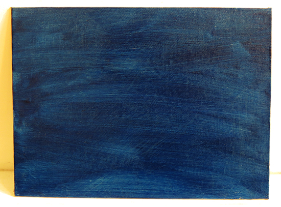
Toning your white panel or canvas before beginning is a good idea and will help you apply the correct values in your block-in. I often use a warm orangeish tone to create a color vibration contrast with my cool blues, but for this demonstration I decided to take the opposite approach and tone my linen panel with Prussian Blue mixed with some NeoMegilp medium. Applied six hours in advance, the NeoMegilp had set up sufficiently enough that it kept my Prussian Blue from easily mixing into every other color, but remained removable with thinner. My first task, after I had sketched in the outlines of my subject with some dark blue, was to remove color from those places where I wanted bright lights. This immediately helped to create a sense of night punctuated by light sources.
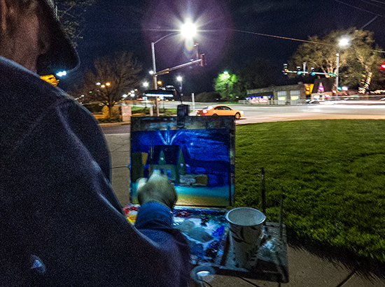
Above you can see the light areas I had previously removed within the developing painting. Right after the lights are removed, I established the darkest darks. This simplifies my task in any painting day or night. Once my two extreme values are in, all other values are compared to them and must fit in between them. The area which gave me the most trouble was the street. It was lit by both an orangeish sodium vapor street light and a new, cooler LED street light. I had to get that blended just right as it was a fairly large mass in the bottom third of my panel and influenced the colors on the little bistro building.
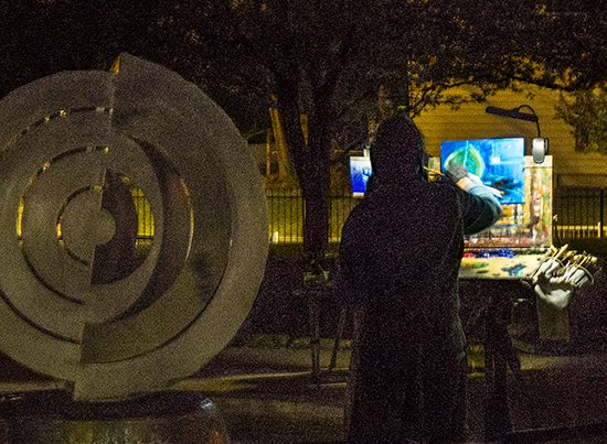
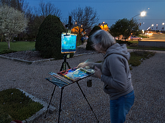
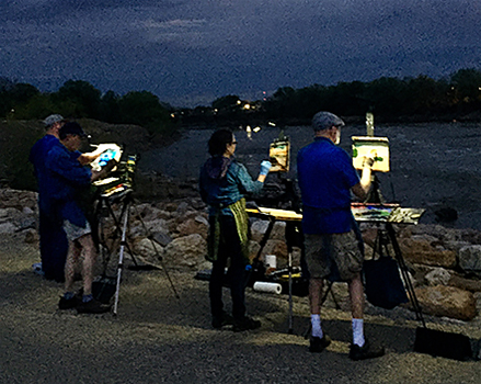
In between demonstrating, Ann and I circulated among our students to give them help with their paintings. Each student picked a different scene to work on. Everyone did remarkably well with this assignment considering it was a first-time experience—in fact, better than I did my first night out. Being prepared to handle a new experience like this is very important to getting the most out of it and can perhaps lead to a life-long love of nocturne painting. We enjoy teaching it as much as painting itself —maybe more, since we are in such good company. And good company makes working in the dark of the night a warm and friendly experience.
On the second night we took the students down to the hydro dam area on the Kaw River near downtown Lawrence. The dam was built on top of a natural ledge of limestone in the river which prevented steamboats from going any further upstream. The mechanical energy from the falling water was harnessed to run all kinds of belt-driven equipment in the flour mill and other buildings in early downtown Lawrence. Today, the operation serves two hydroelectric power plants and the dam height can be automatically raised or lowered.
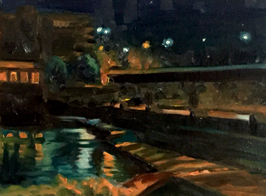
Above is my 9 x 12" oil demonstration painting of our subject. I have lightened all the values here and extended the value range to add details. Strong winds from an approaching storm made this night a challenge as we had not brought rock bags along to weigh down our easels - a couple nearly blew down while we were painting. We were continually under threat by a severe storm which threw out lightning all around in the distance. As luck would have it, the storm parted in two just as it neared our position and went around us. Not even a drop of rain!
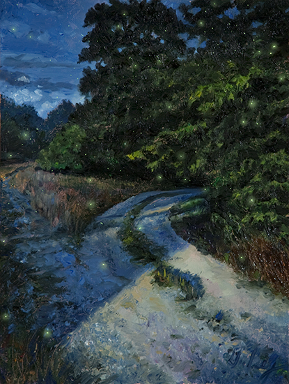
The painting above is a pure moonlight nocturne—no man-made light around, so I was seeing only with the rods in my eyes. I think you can see that I artificially added some warm colors to this piece to make it less cold-looking, and raised the values up quite a bit so the painting would look "right" under indoor illumination levels. The fireflies were added after the painting had dried.
|
Become an Artist's Road Member Today!
Already a Member?Log in here. To renew your membership, log in and follow the links. Search the SitePerspectivesNot ready to become a Member yet? Subscribe to our free email postcards, "Perspectives". Enter your email address here.
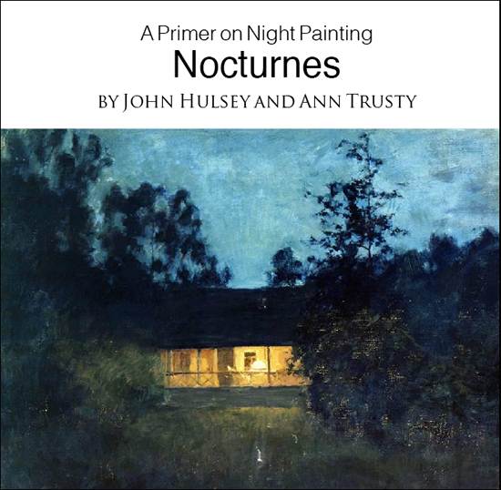
Member ContentFree ContentThe Artist's Road StoreNocturnes - A Primer on Night Painting Filled with inspirational examples by the masters of nightime painting, this little book is sure to fire up your creative energies. Never tried painting at night? We show you how it's done with a step-by-step-oil demo and a tale of night painting in the wilds of Rocky Mountain National Park. The Primer on Night Painting - Nocturnes is a 7 x 7" PDF download with 40 pages of text and images. It includes a gallery of paintings by masters of the nocturne, information to inspire and encourage you in your plein air nocturne painting, an illustrated step-by-step demo and tips for working in pastel and oil. Also available in a softcover edition. Check out the tools and other products that we use in our own art and travels in The Artist's Road Store. We only offer things for sale that we enthusiastically believe in.
About Us
|
 Voices of Experience:Richard K. Blades
 ing Watercolors
 Nocturne Notes
 Inspiration in Monet's Gardens
 The Watercolor Medium
 The Perspectives Archive