Drawing with Pastels - Perspectives from The Artist's RoadDrawing with Pastels Perspectives from The Artist's Road For those of us who love to draw and also love color, the natural choice is pastel. I began painting outdoors in pastel in the 1980s, when we were living in Garrison, New York, on the Hudson River. Winters are often long, cold and snowy in the Hudson Valley, and I needed a medium insensitive to cold that could be portable as well. I made my first plein air pastel paintings with a small set of 48 colors and quickly realized that I needed more—many more, to express what I wanted. Now, I have more than I need for any one picture so the daily job is to pare down to just what is necessary.
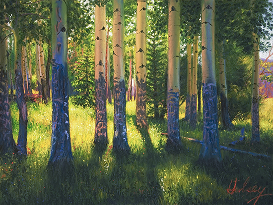
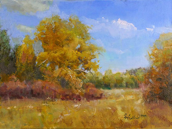
Surface is also very important when drawing with pastel, and there are now many great papers and boards from which to choose. Wallis and Richeson make some extremely good surfaces, along with Dakota and Artfix. I have tried all of them, and often use the lightweight Richeson Gatorfoam boards in gray or brick red. I also prepare my own surfaces. Different textures yield different results, and it is important to try many different ones to find favorites. To make my own surfaces, I use Golden Acrylic Pastel Ground on top of a coat or two of gesso on a suitable substrate, like masonite. This ground can be applied to any paper or board. If more tooth is wanted, additional marble dust or grit can be added to the ground to create a unique custom surface. The painting Aspen Light II was painted on a custom ground, and it has a different look to it than the other very uniform commercial surfaces.
Pastelists usually like to work on a colored ground, and here, too, there are many choices. Working on a color has advantages over working on white. The color of the ground can serve as a major unifying tone throughout the painting, and therefore do some of the work. The other advantage is that painting on any value darker than white makes subsequent value comparisons easier. Look closely at Kim Lordier's painting above and you might detect her colored ground peeking through here and there. (Members can visit our interview with Lordier here: Voices of Experience - Kim Lordier). A big part of the ease and fun of pastel is in mixing colors on the paper. One can drag the flat side of a stick to create a solid tone here, push an edge down hard to make a line there, and vary pressure on line work to create a sense of thick and thin. One can also use the traditional technique of cross-hatching to blend tones, or rubbing one color into another with fingers or a stomp to create a new tone from separate strokes of color. Over all this initial work, there is the irresistible urge to create sharp calligraphic marks and strokes—evidence of the artist's hand, which can energize a work and excite the eye. There are so many possibilities for creative invention with the medium that it encourages experimentation.
Above all, pastel invites us to play with colors, values and ideas, and this is so valuable to the creative process. Each new blank surface represents a low-risk, high-reward playground for art-making. And as we know, out of play, have come many great works of art. Try it for yourselves, you may fall in love! |
Become an Artist's Road Member Today!
Already a Member?Log in here. To renew your membership, log in and follow the links. Search the SitePerspectivesNot ready to become a Member yet? Subscribe to our free email postcards, "Perspectives". Enter your email address here.
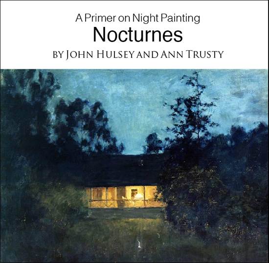
Member ContentFree ContentThe Artist's Road StoreNocturnes - A Primer on Night Painting Filled with inspirational examples by the masters of nightime painting, this little book is sure to fire up your creative energies. Never tried painting at night? We show you how it's done with a step-by-step-oil demo and a tale of night painting in the wilds of Rocky Mountain National Park. The Primer on Night Painting - Nocturnes is a 7 x 7" PDF download with 40 pages of text and images. It includes a gallery of paintings by masters of the nocturne, information to inspire and encourage you in your plein air nocturne painting, an illustrated step-by-step demo and tips for working in pastel and oil. Also available in a softcover edition. Check out the tools and other products that we use in our own art and travels in The Artist's Road Store. We only offer things for sale that we enthusiastically believe in.
About Us
|
 ing Watercolors
 The Watercolor Medium
 Paintings & Their Places
 Essential Photo Tools for the Landscape Artist